OFF MENU
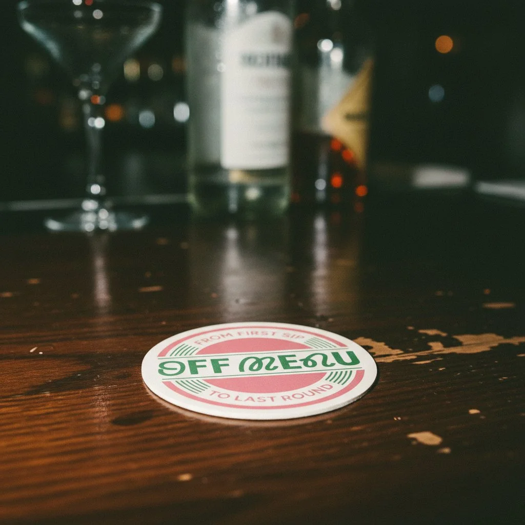
OFF MENU exists in the space between soft drinks and spirits, a lifestyle drinks brand designed for the way we actually live now. With Sober October, Dry January, and a generation redefining their relationship with alcohol, I saw an opportunity to create something deliberately ambiguous.
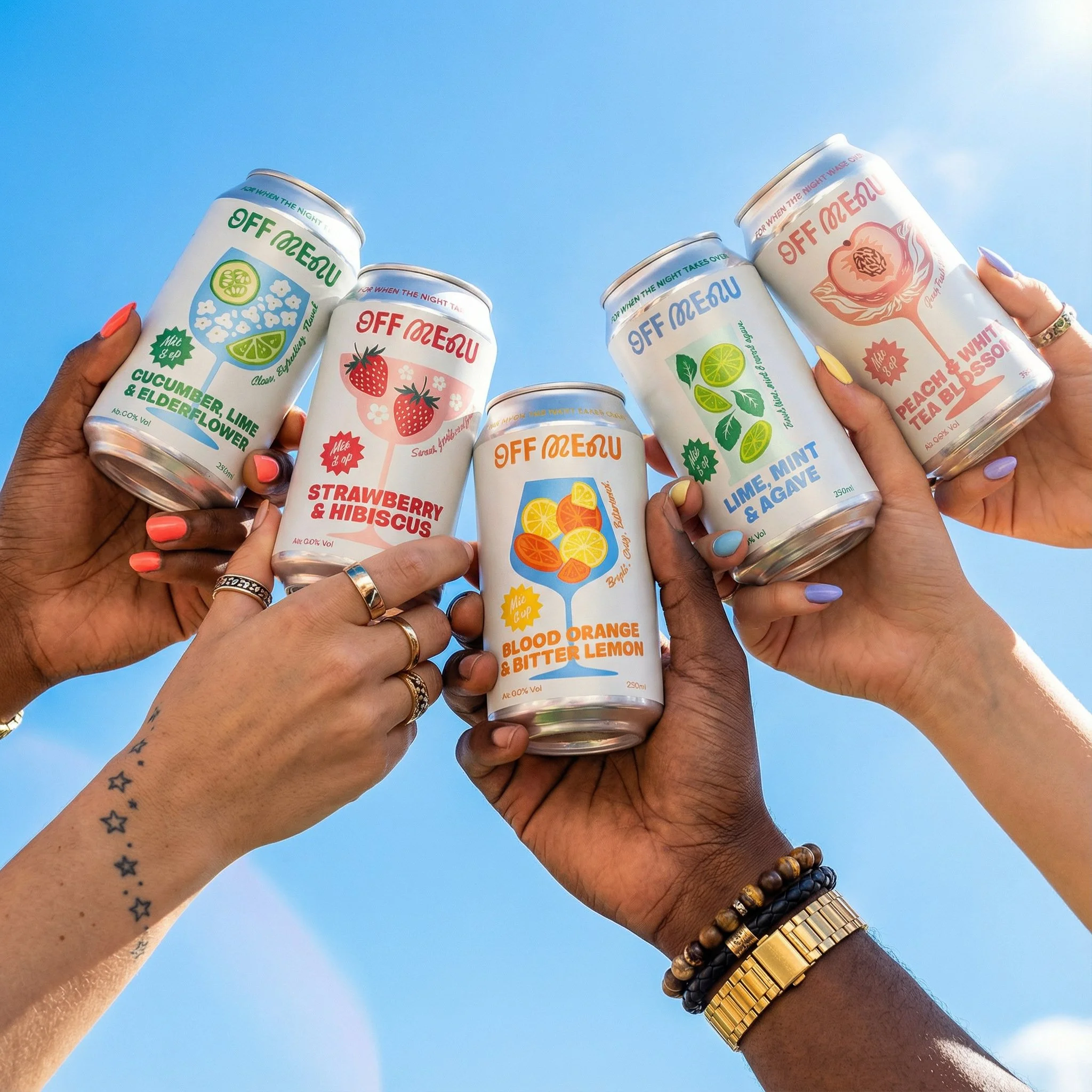
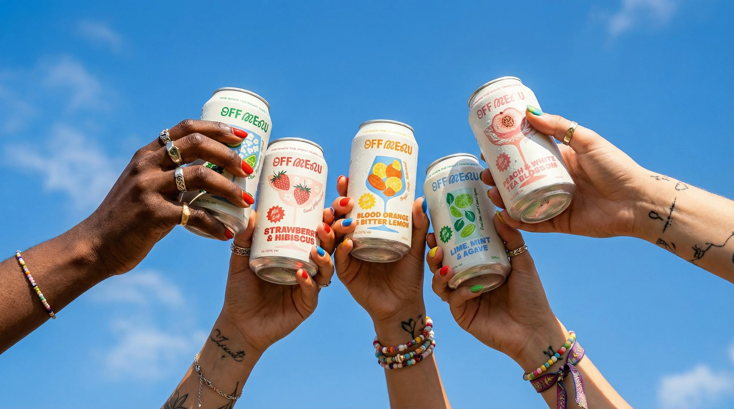
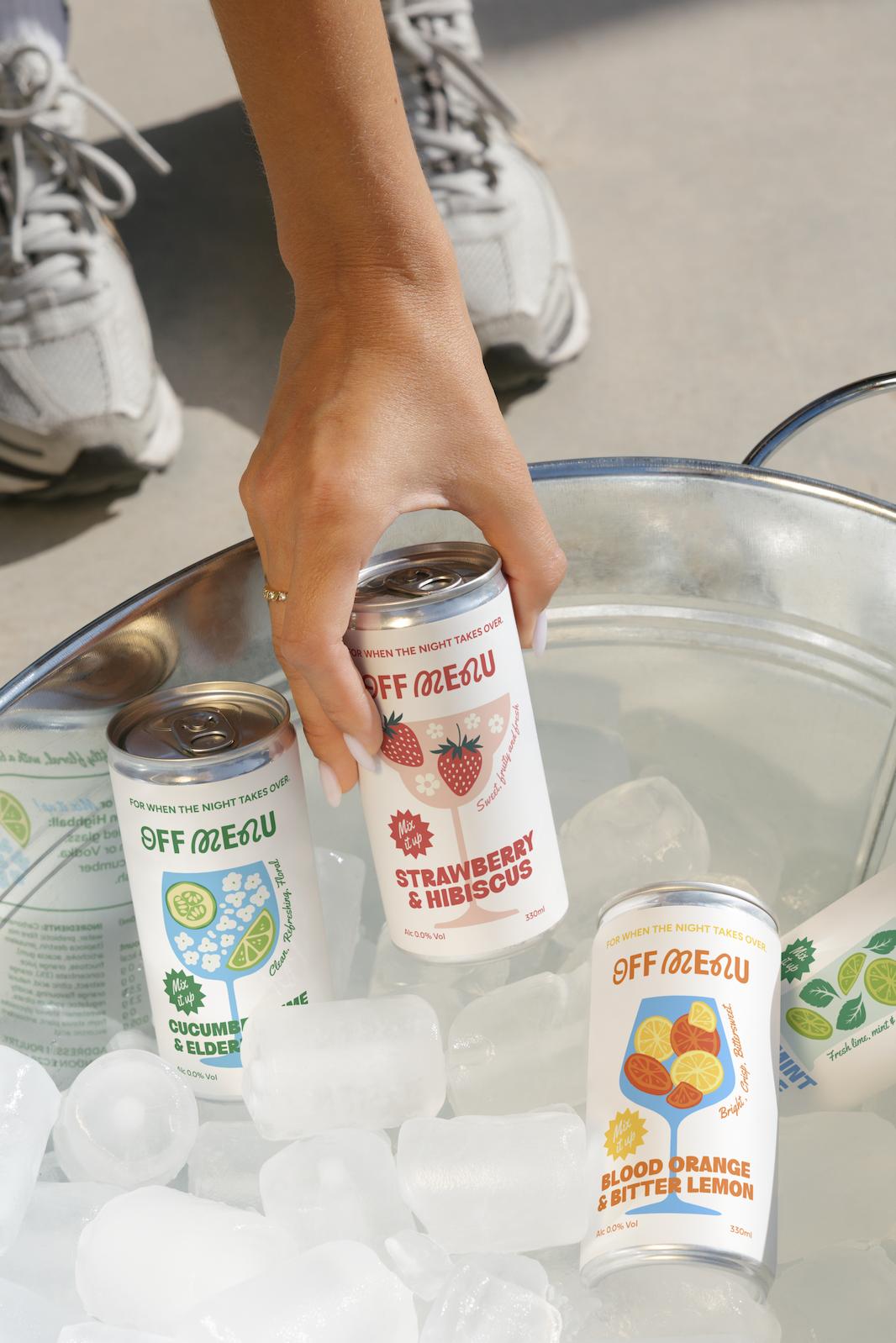
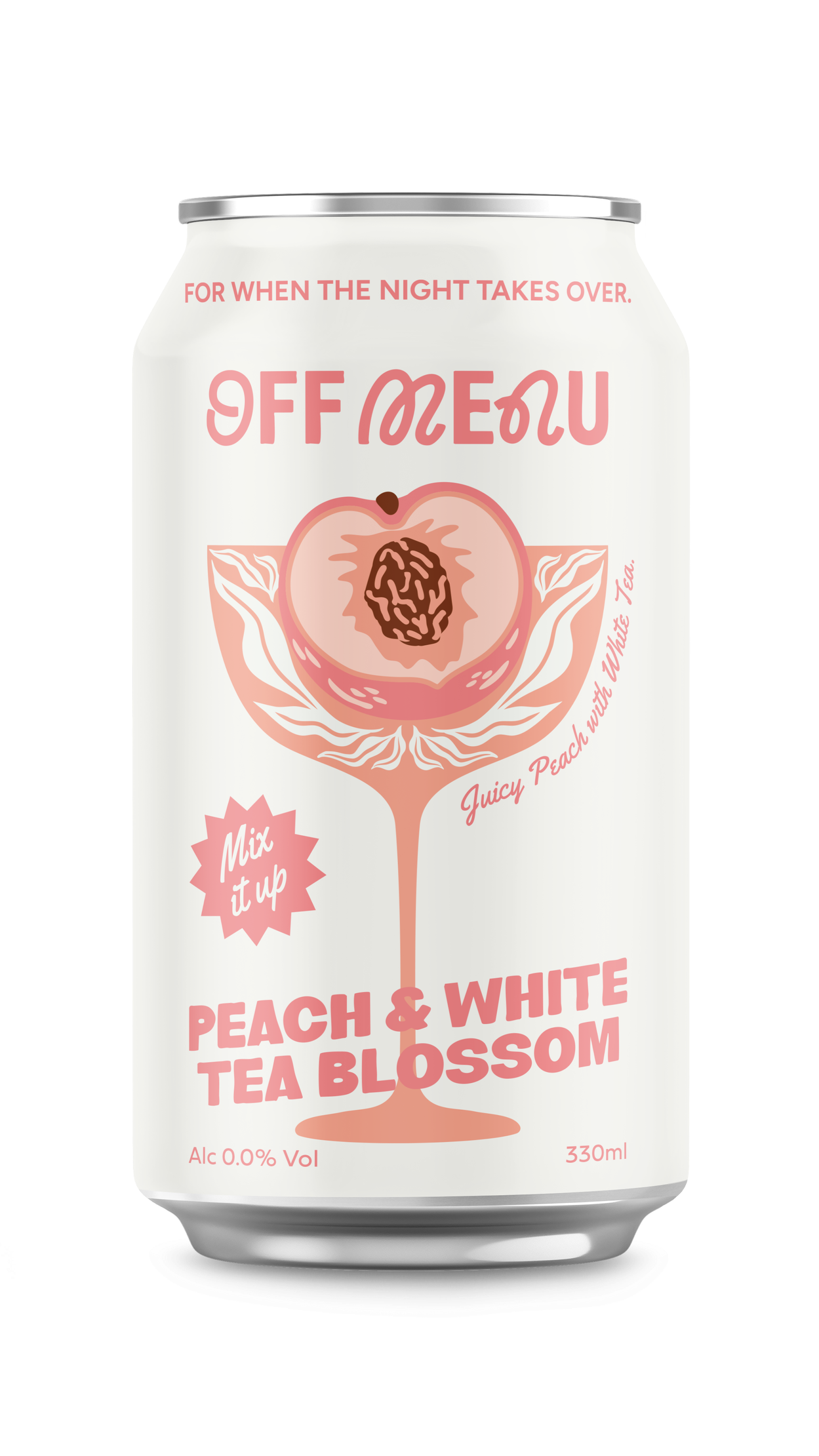
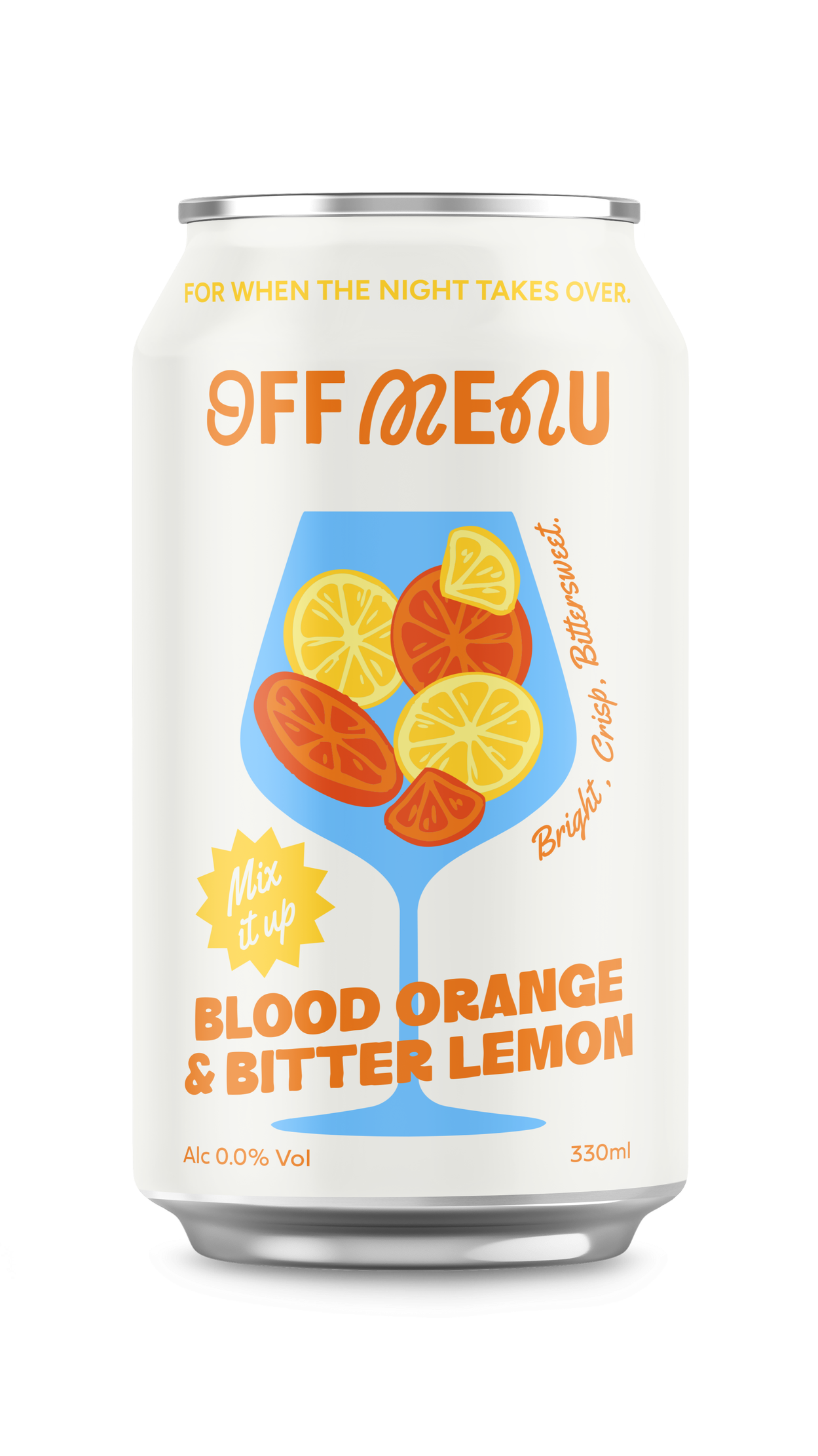
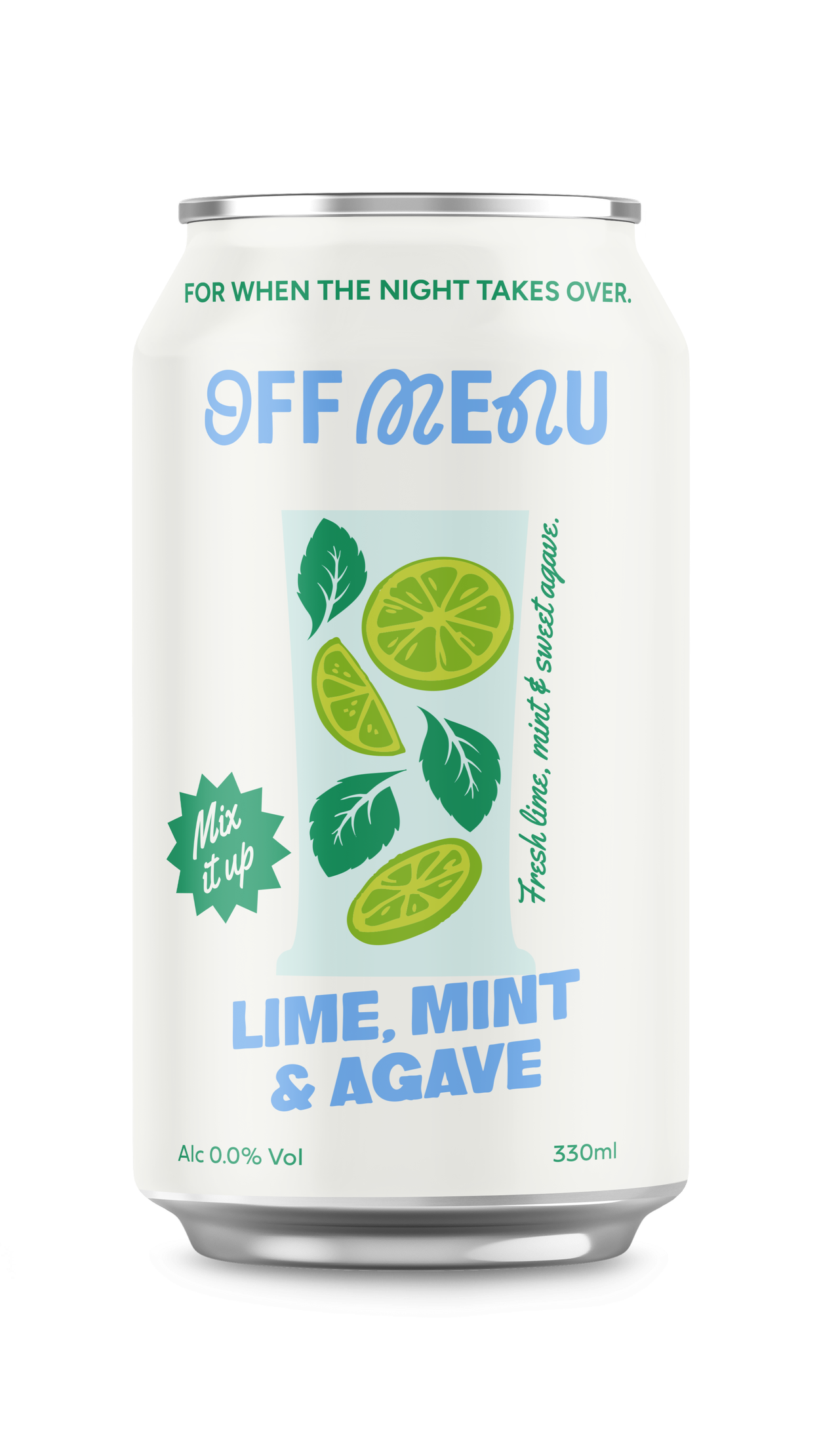
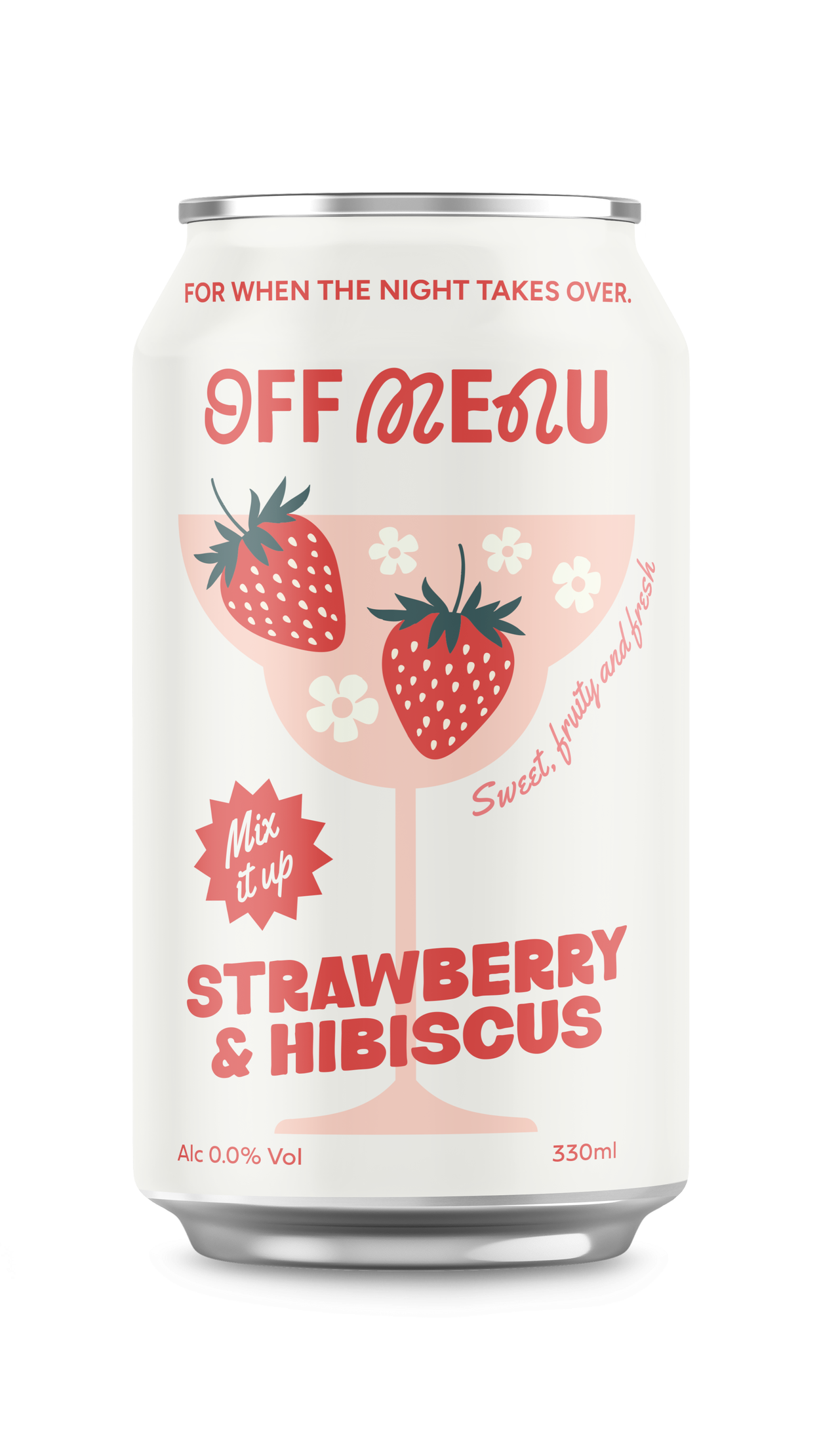
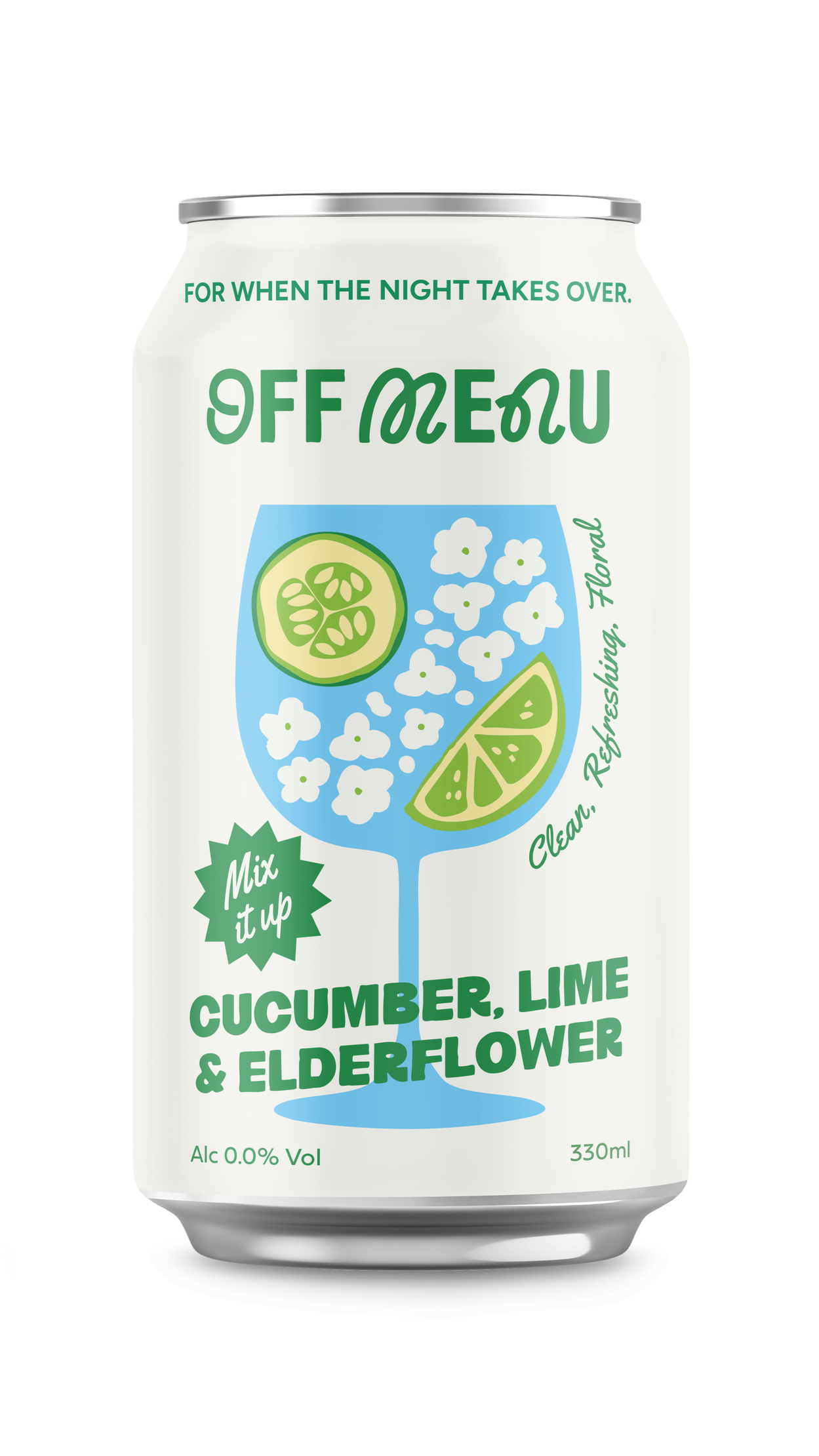
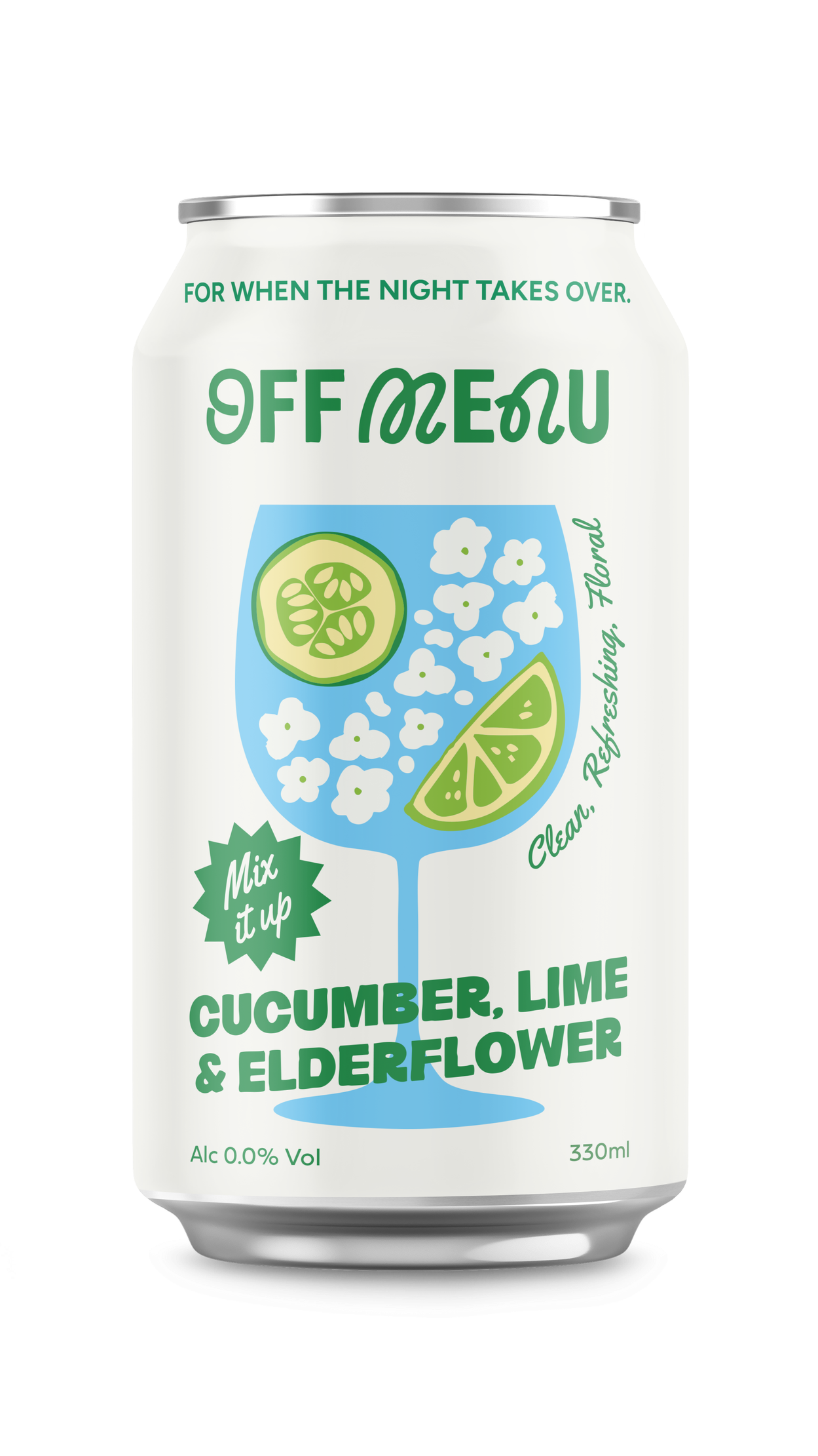
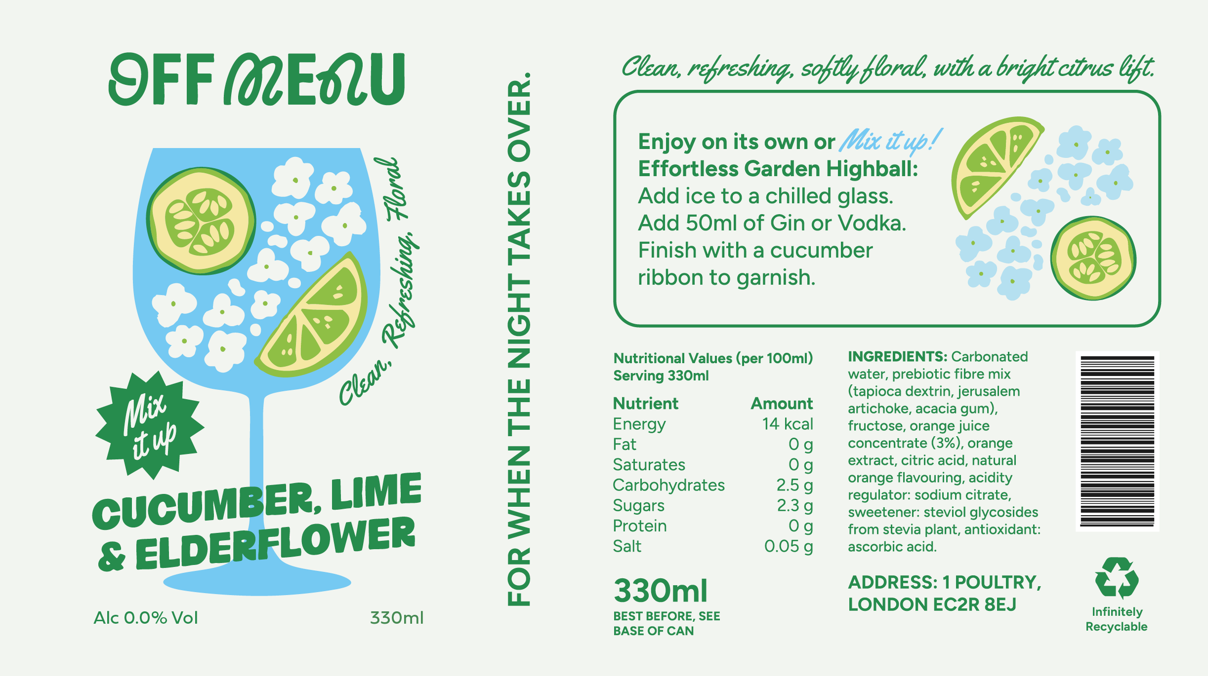
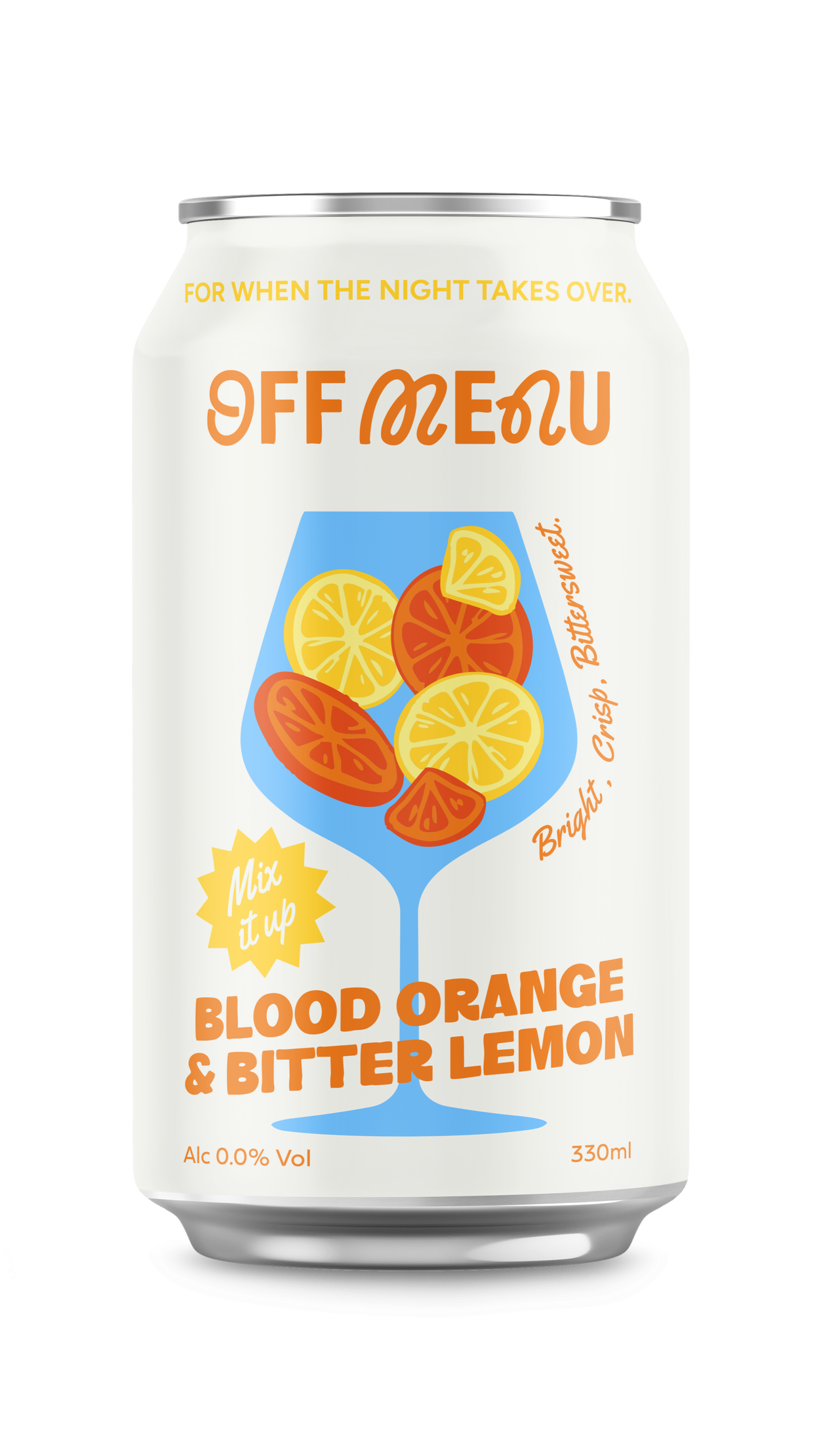
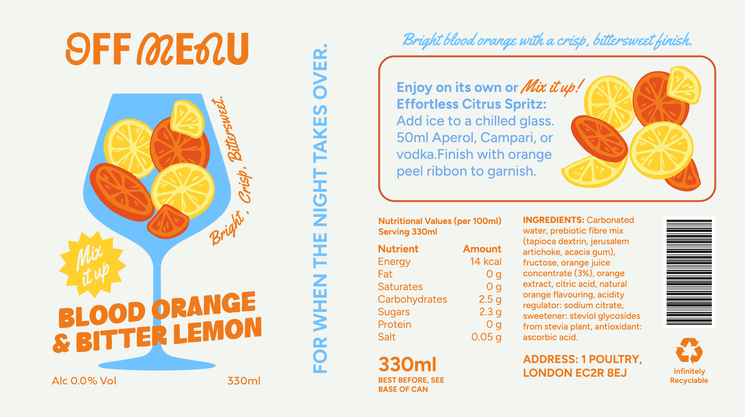
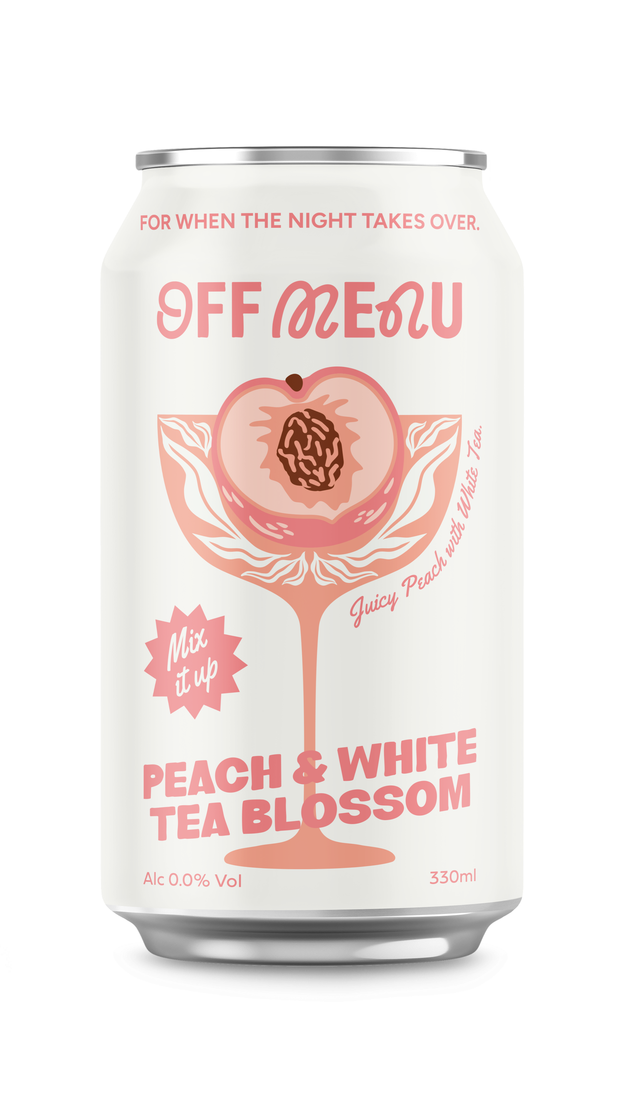
The glass illustrations and premium aesthetic give OFF MENU the visual language of an adult drinks brand, removing the awkwardness of explaining your choices while keeping the night’s energy intact.
Whether you’re pacing yourself, taking a break, or simply don’t drink, these aren’t your average mixers. They’re crafted to elevate spirits into something special, or stand confidently on their own as a sophisticated alcohol-free option.  OFF MENU offers flavour, freedom, and the choice to say yes to whatever comes next.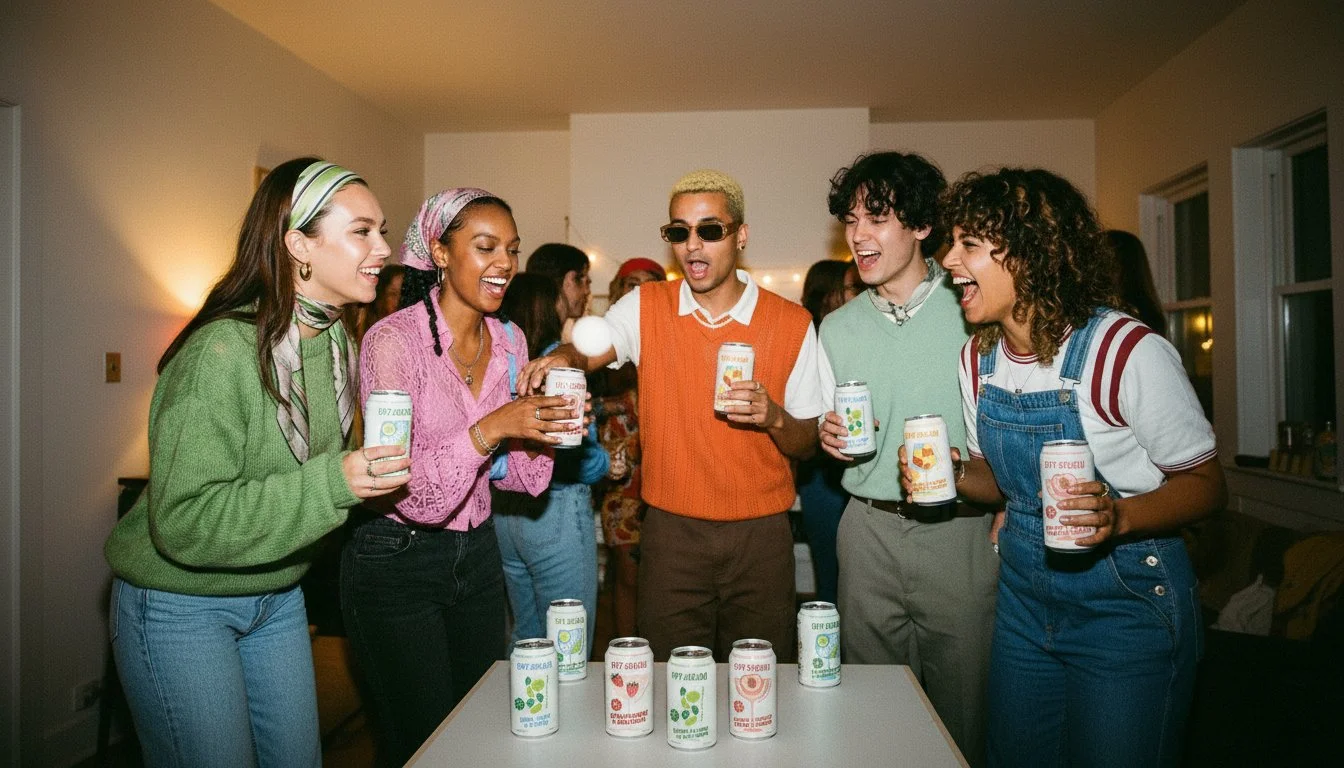
LOGO DIRECTIONS
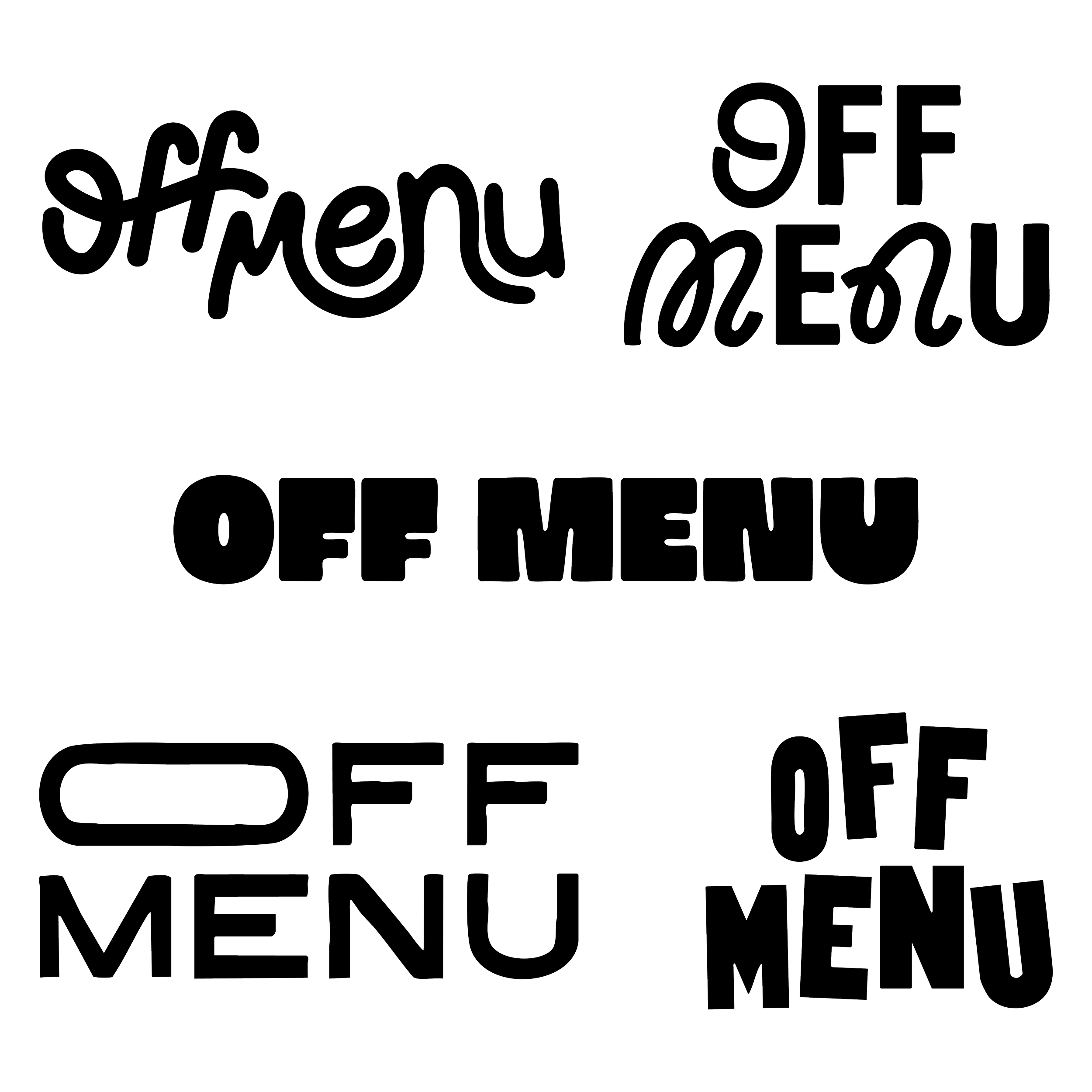
The visual identity needed to reflect OFF MENU’s dual nature, a drink that moves seamlessly from afternoon refreshment to evening ritual, from mindful to carefree. I explored four distinct directions, each capturing a different facet of the brand’s spontaneous, culturally-aware personality. Ultimately, I landed on a mixed typeface approach that embodies this split identity.
By combining a clean, modern sans-serif with a loose, handwritten script, the logo itself becomes a visual representation of versatility. Sophisticated enough for daytime social moments, playful enough for nights that take an unexpected turn. The contrast between structured and spontaneous, polished and human, perfectly captures a brand designed for people who refuse to choose between being put-together and letting go. It’s a mark that works as hard as the drink itself: confident in its duality, unapologetic in its refusal to be just one thing.
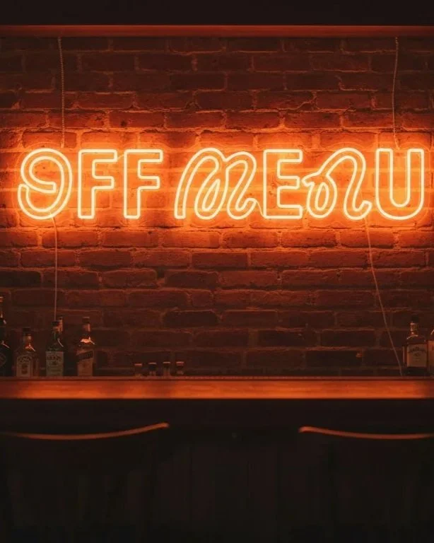
I selected the second mixed typeface direction, pairing handwritten script with a modern sans-serif, because it visually embodies OFF MENU’s dual identity. The handwritten element brings spontaneity and human warmth, while the clean sans-serif provides structure and sophistication.
It’s confident enough for premium spaces, playful enough for late-night moments.
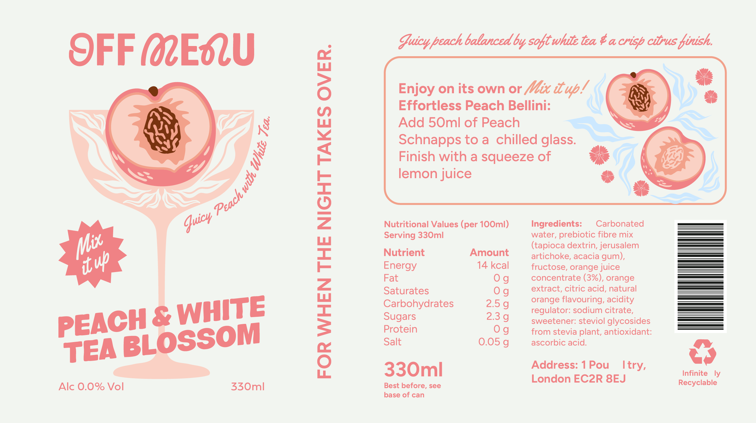
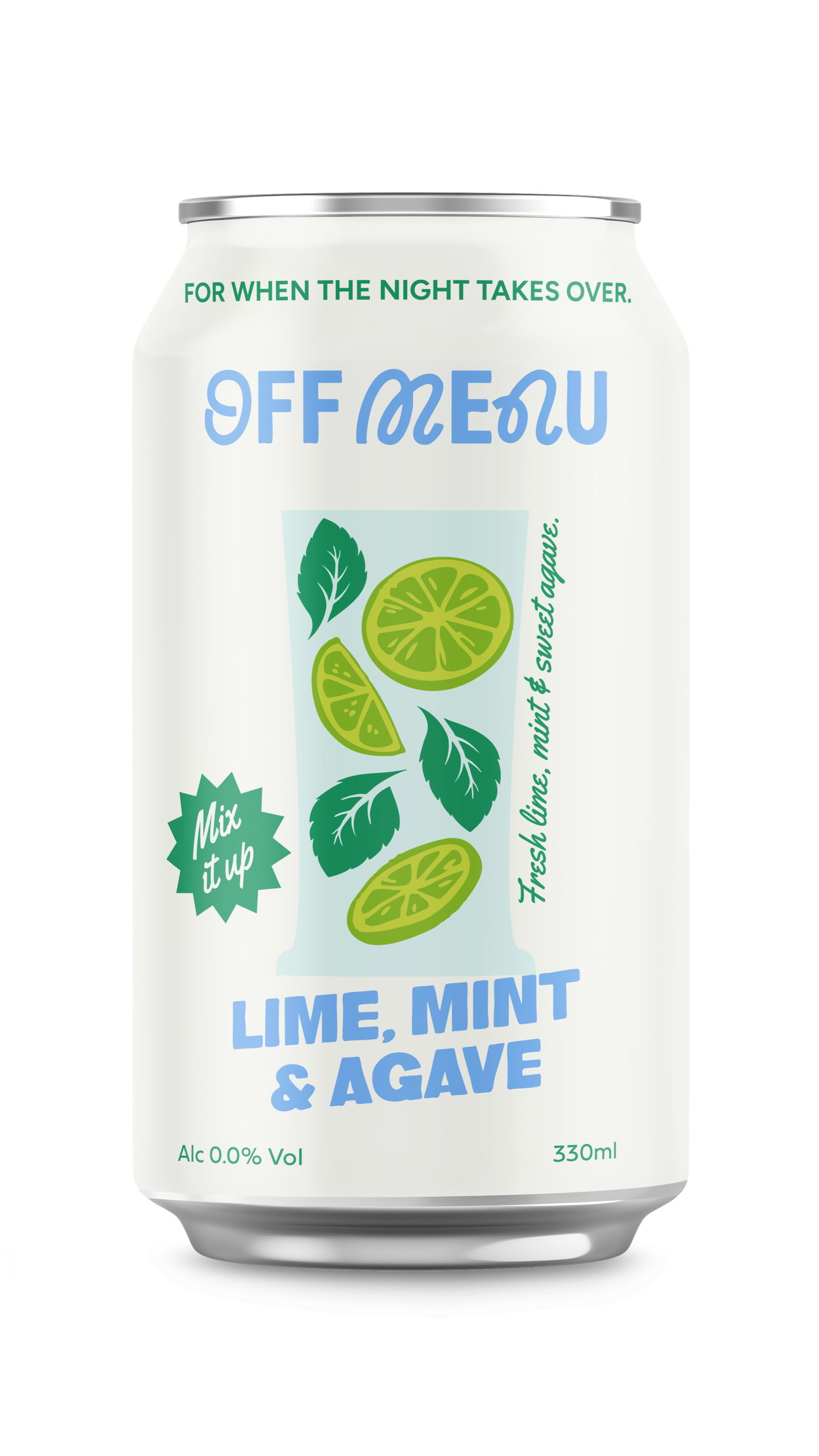
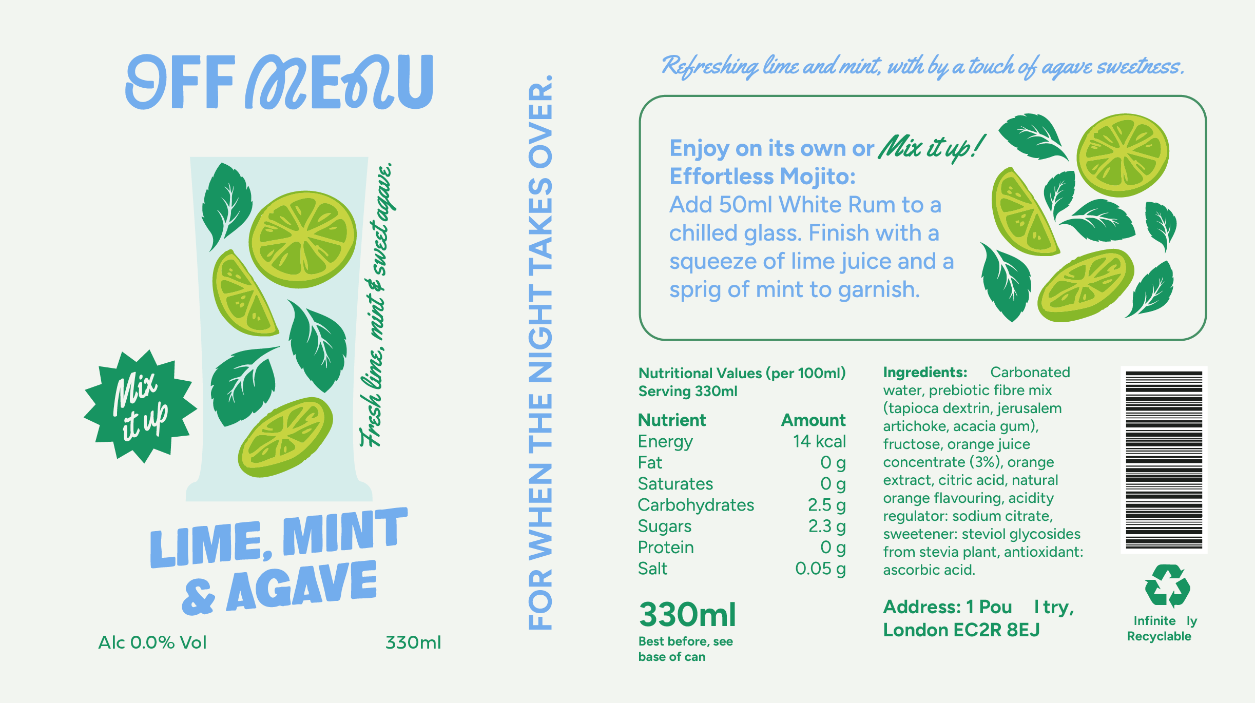
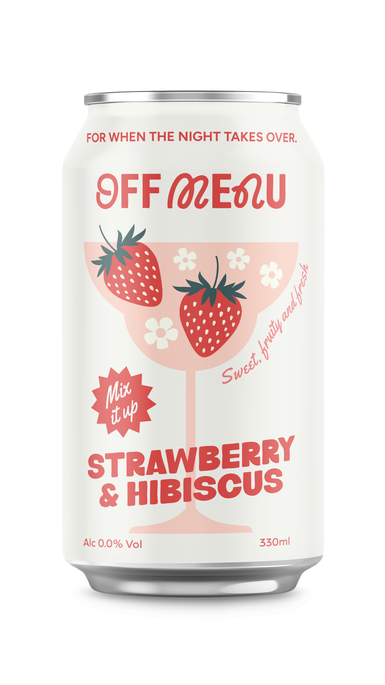
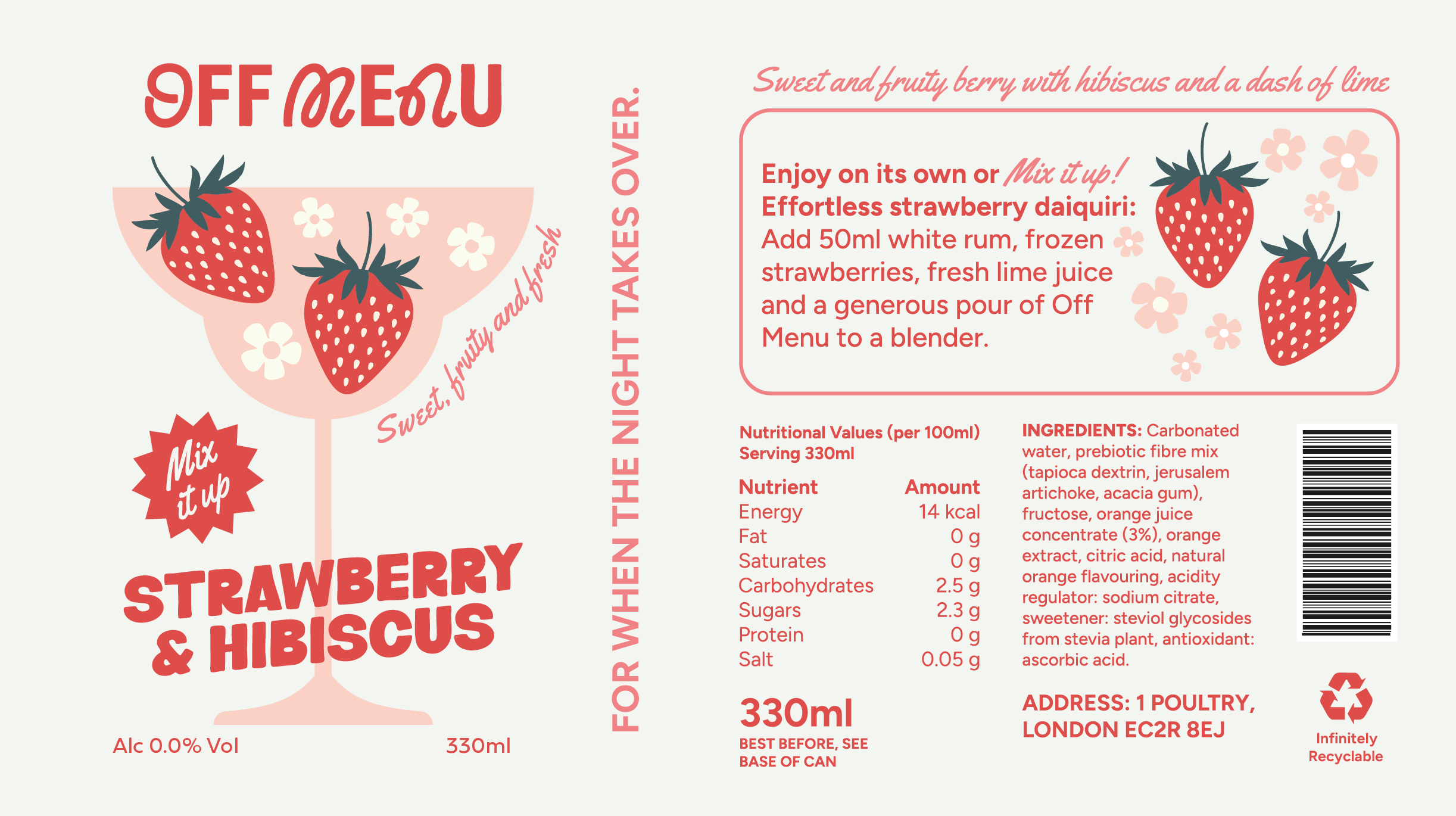
FOR WHEN THE NIGHT TAKES OVER
〰️
FOR WHEN THE NIGHT TAKES OVER 〰️
ADVERTISING
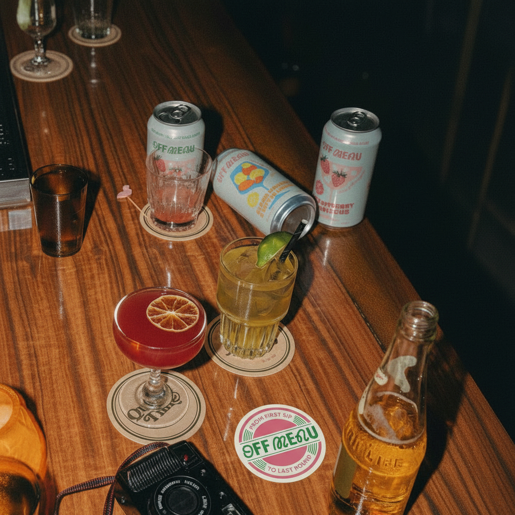
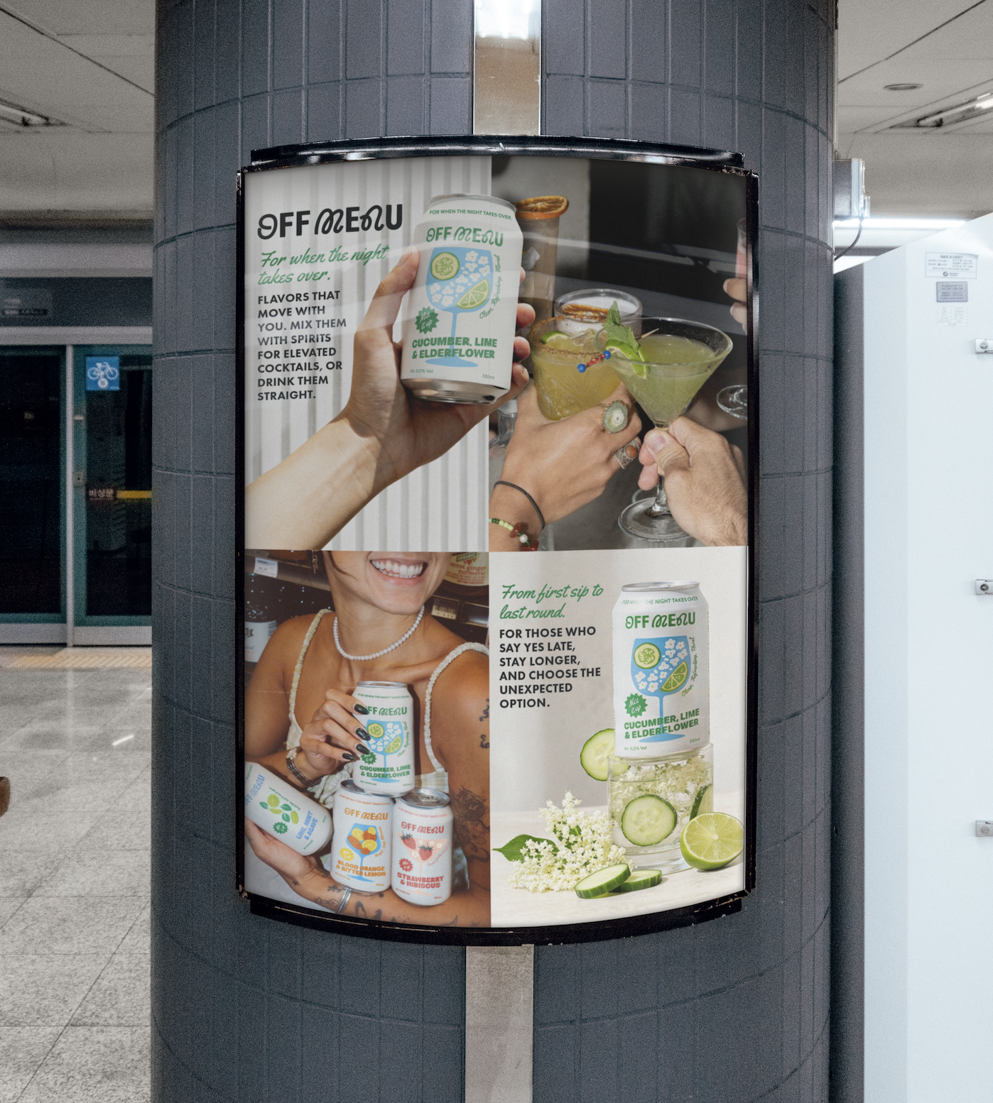
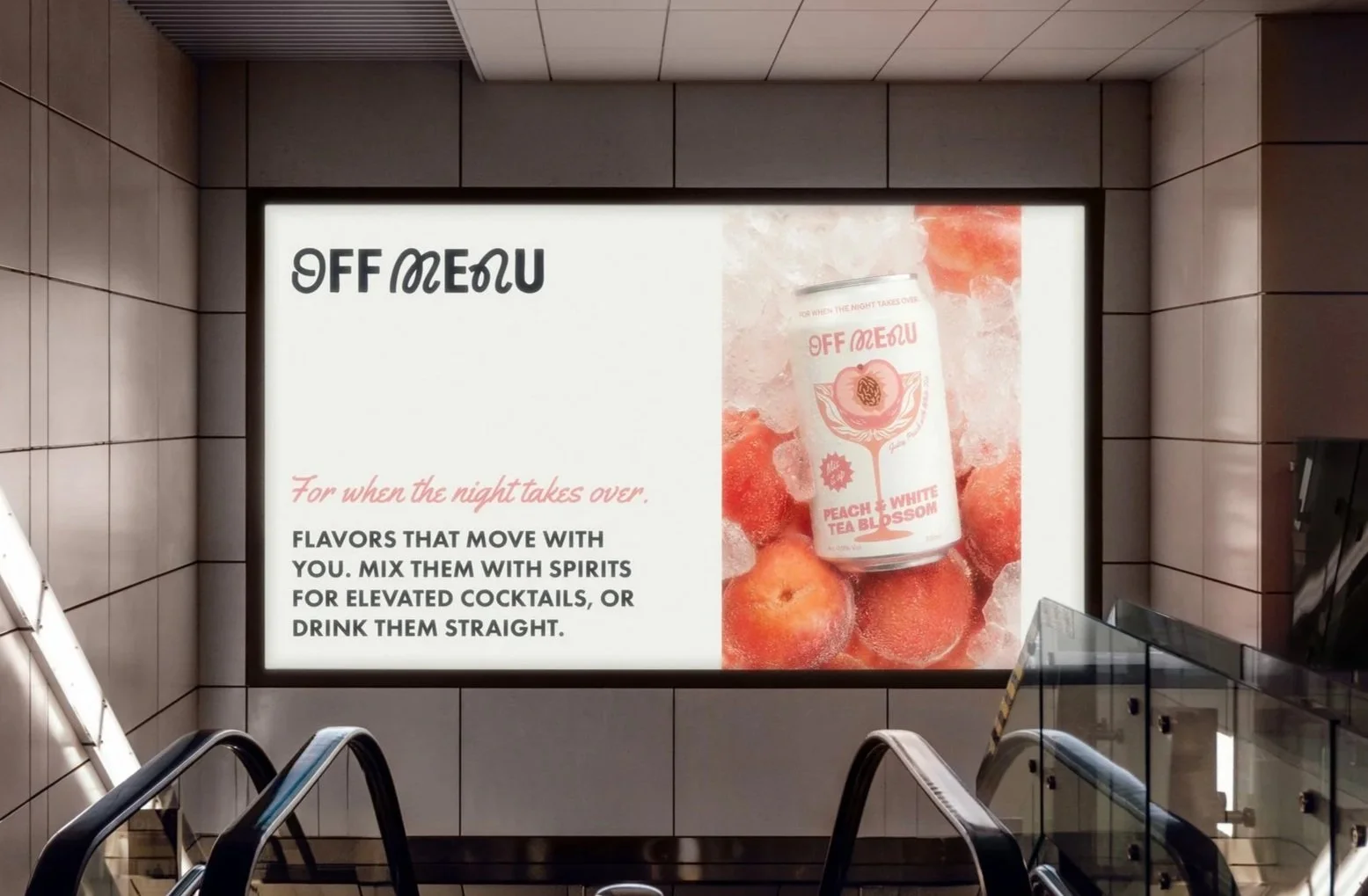
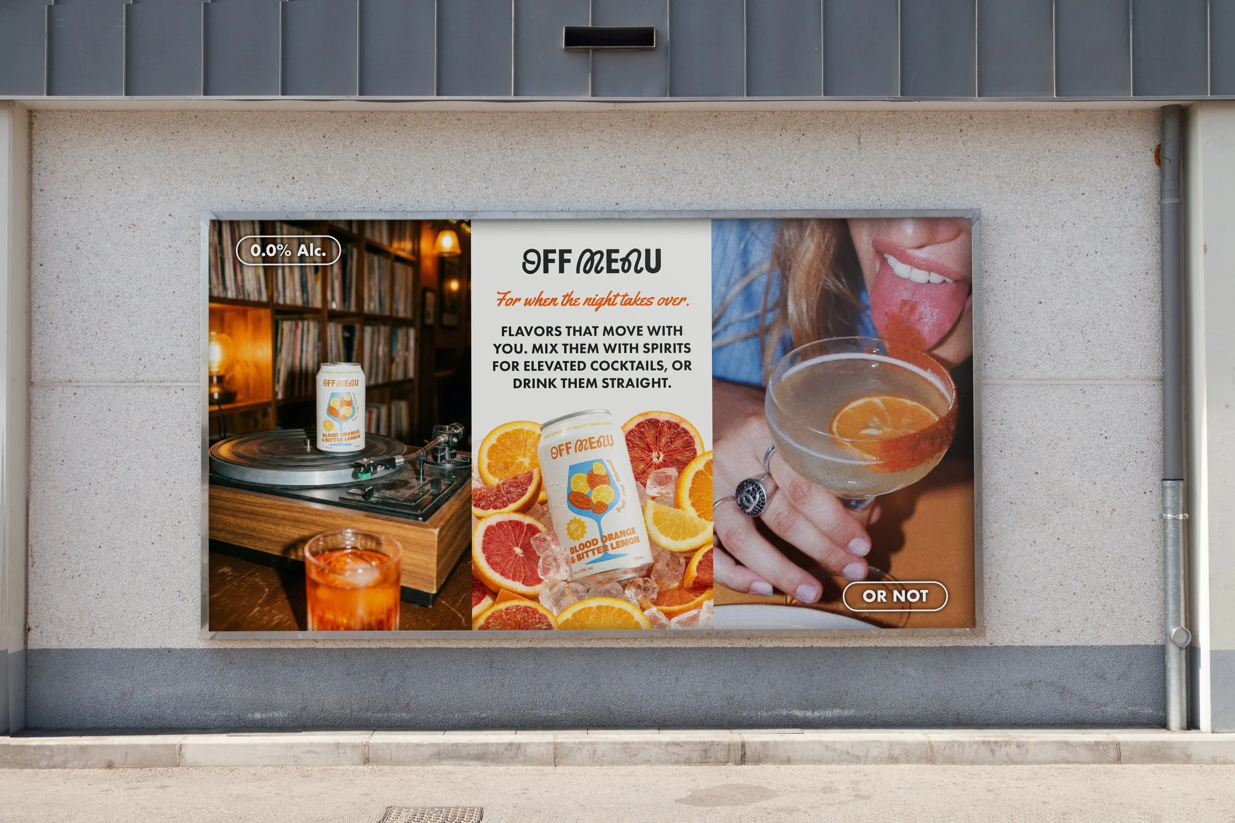
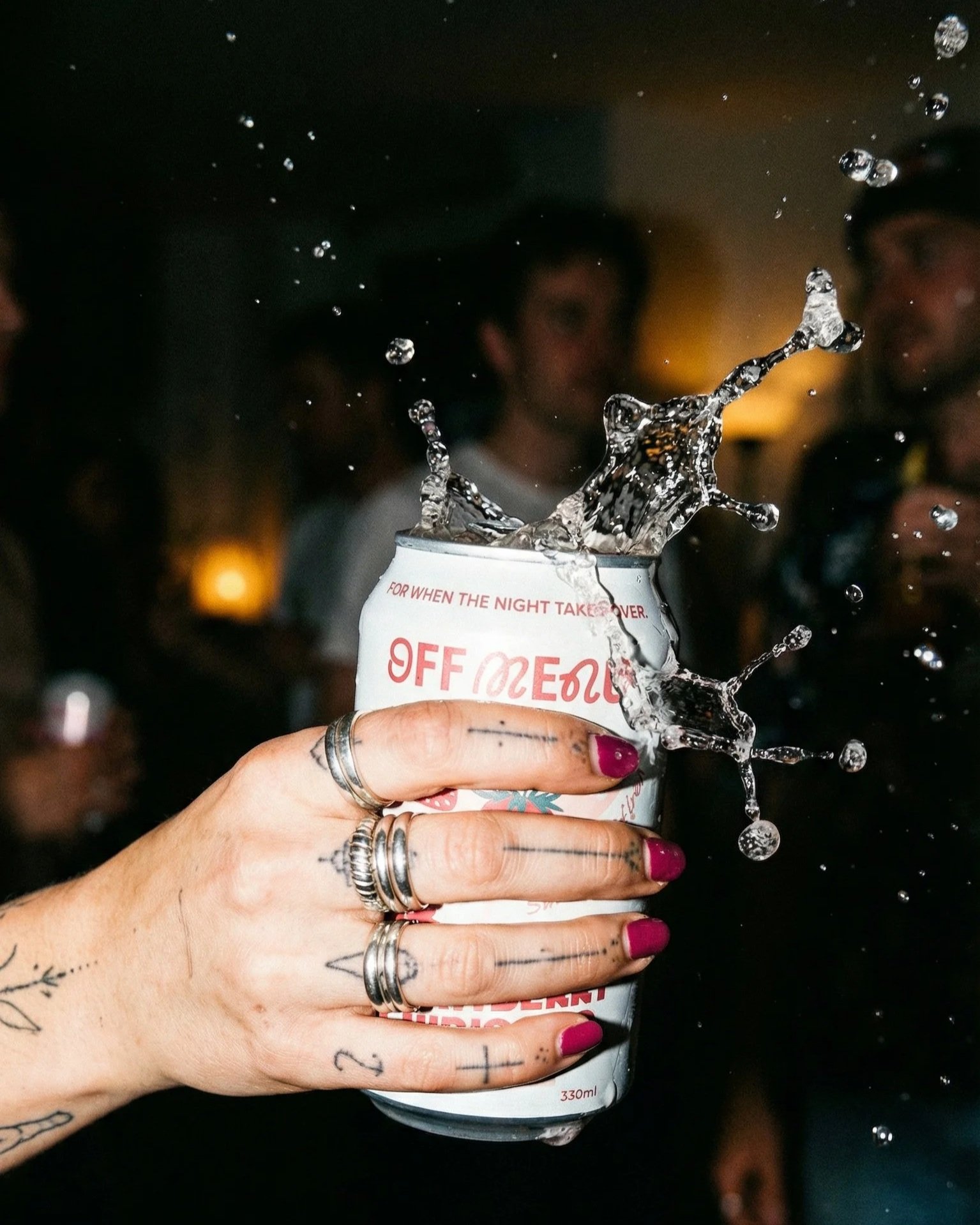
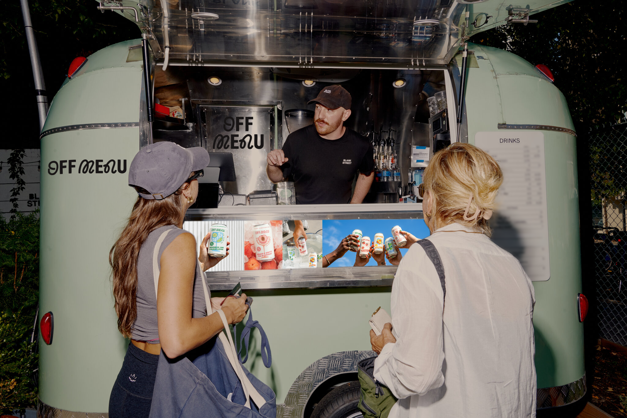
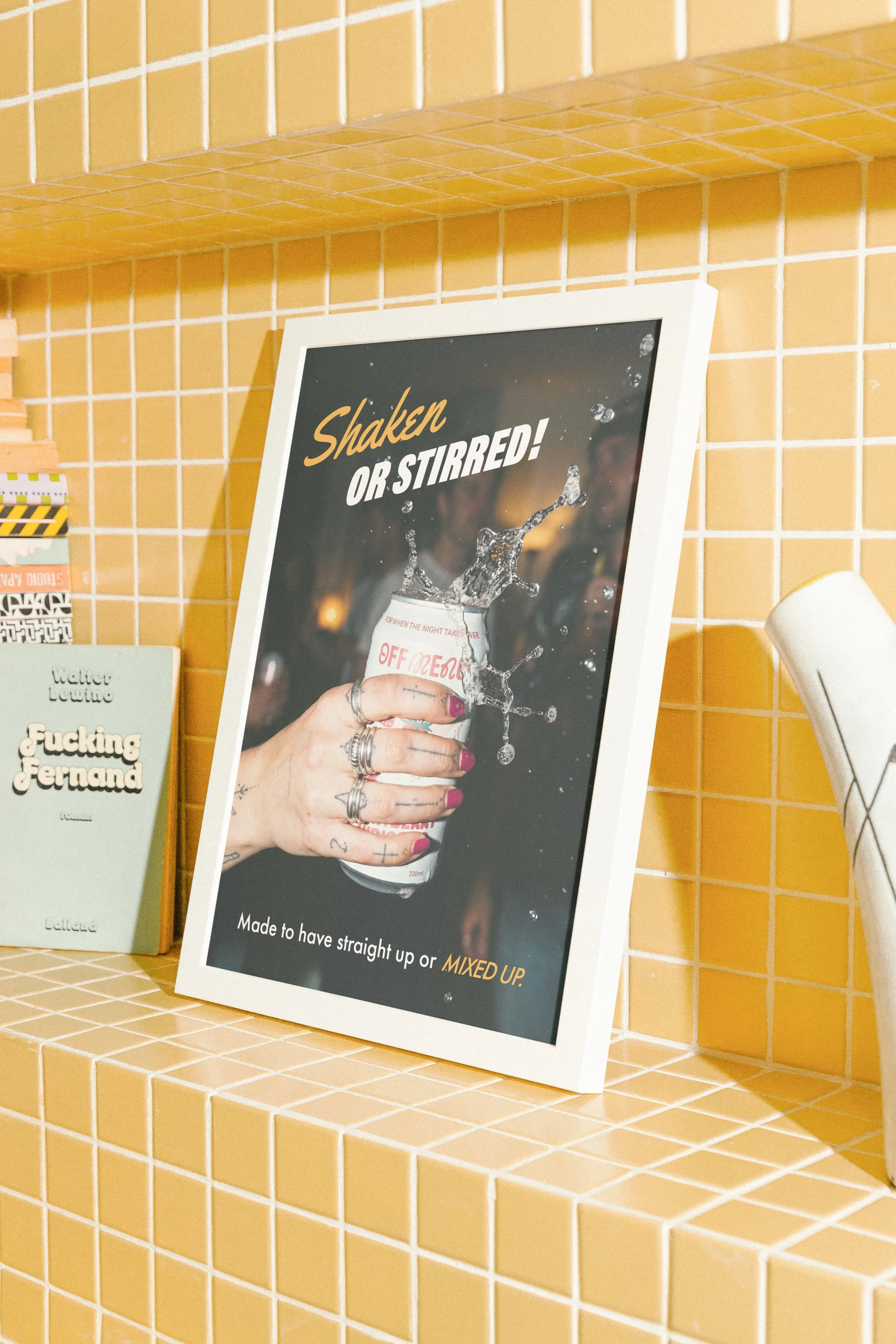
The billboard campaigns use high-contrast flash photography with a raw, unpolished aesthetic, like they’re shot on film or digital camera to capture authentic late-night energy. By layering photographic elements with illustrated components, I’ve created a collage effect that adds depth and dimensionality, making the work feel tactile and alive rather than flat and overly produced.
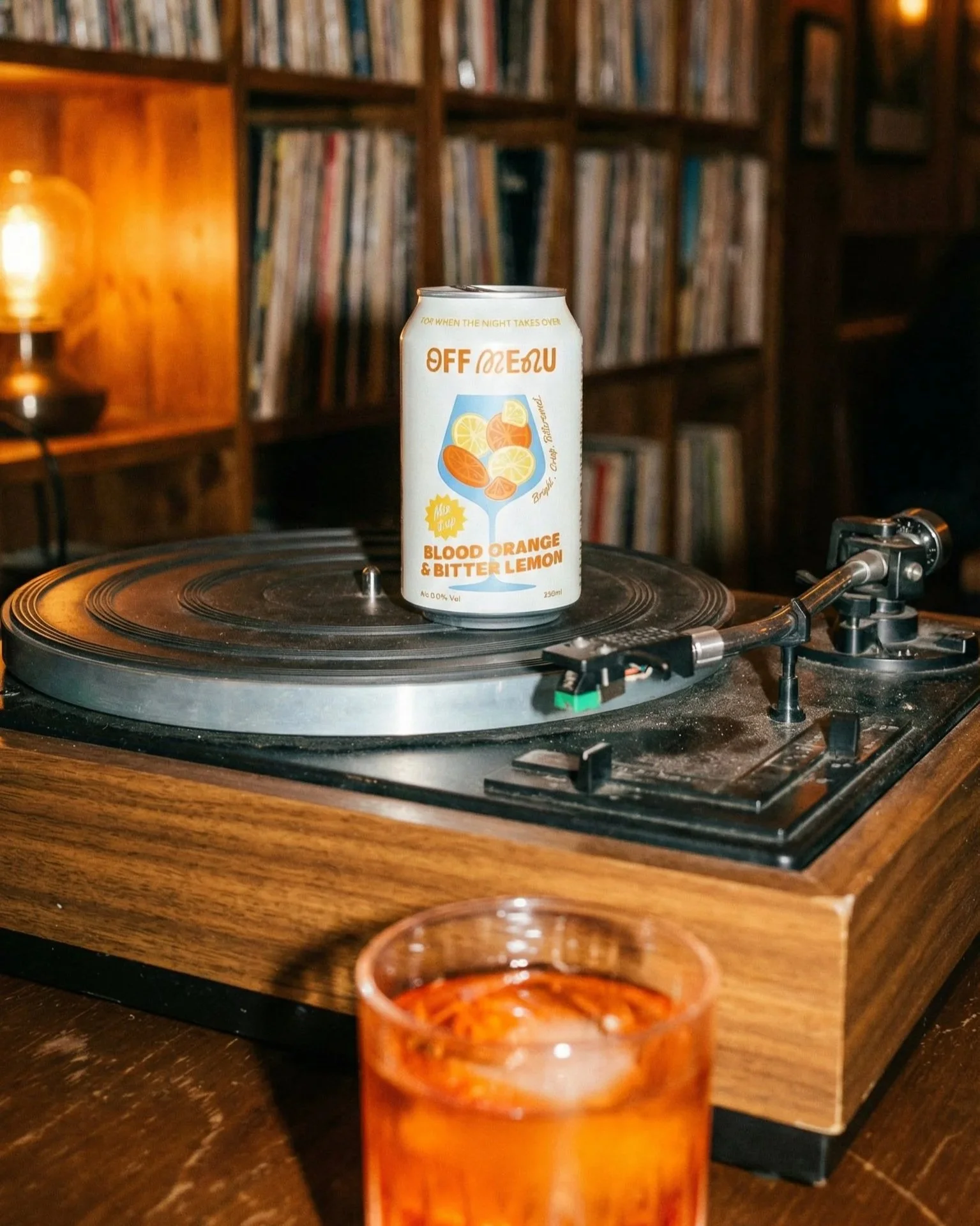
Crucially, each execution features both OFF MENU cans and alcoholic drinks in frame, reinforcing the brand’s core versatility. They’re not just standalone beverages or basic mixers.

DIGITAL & SOCIAL
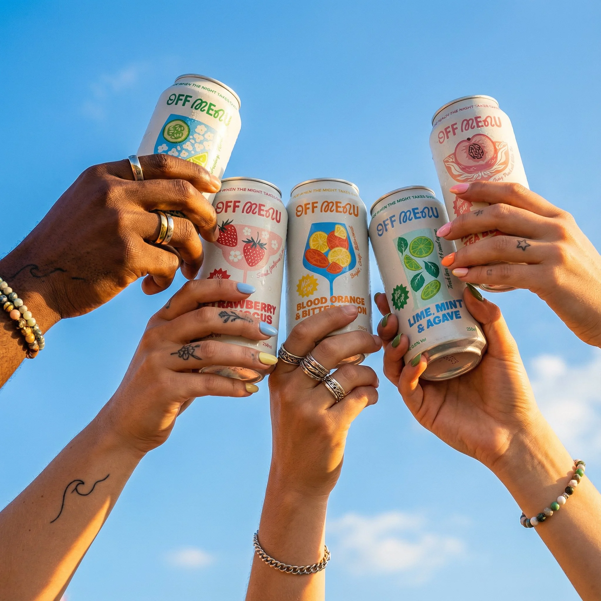
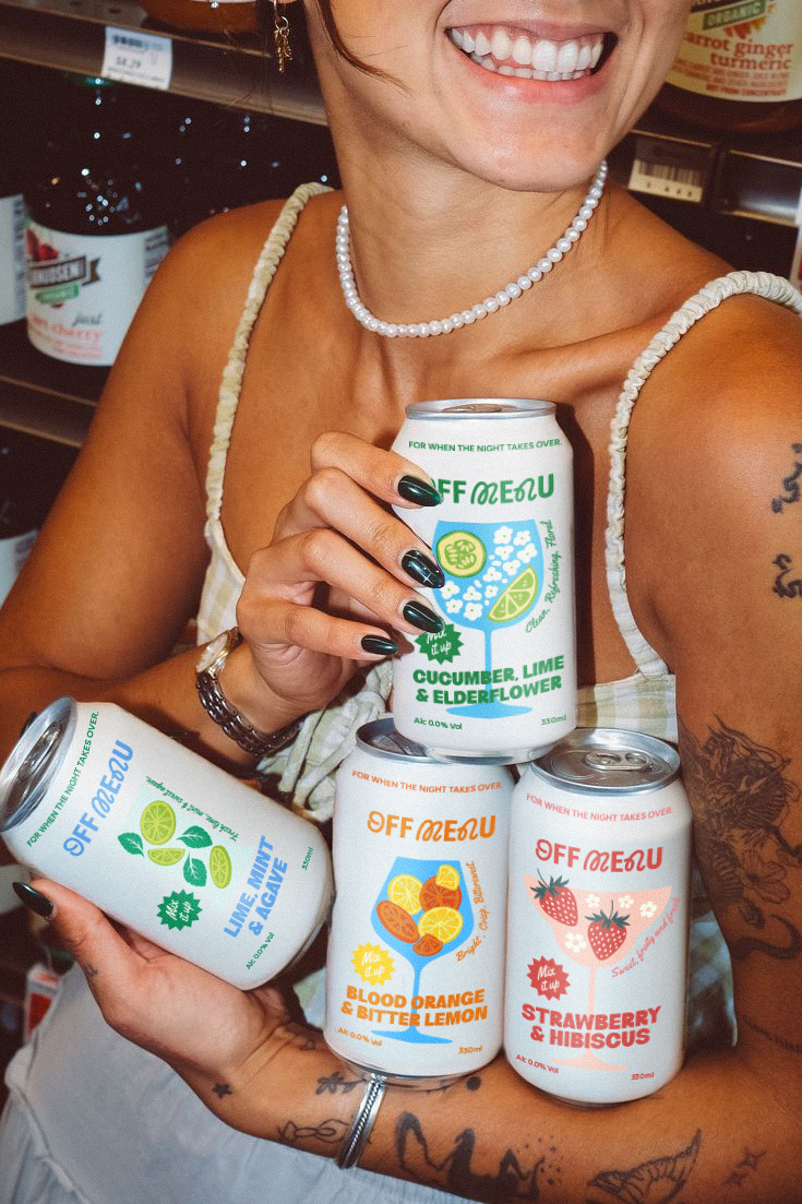
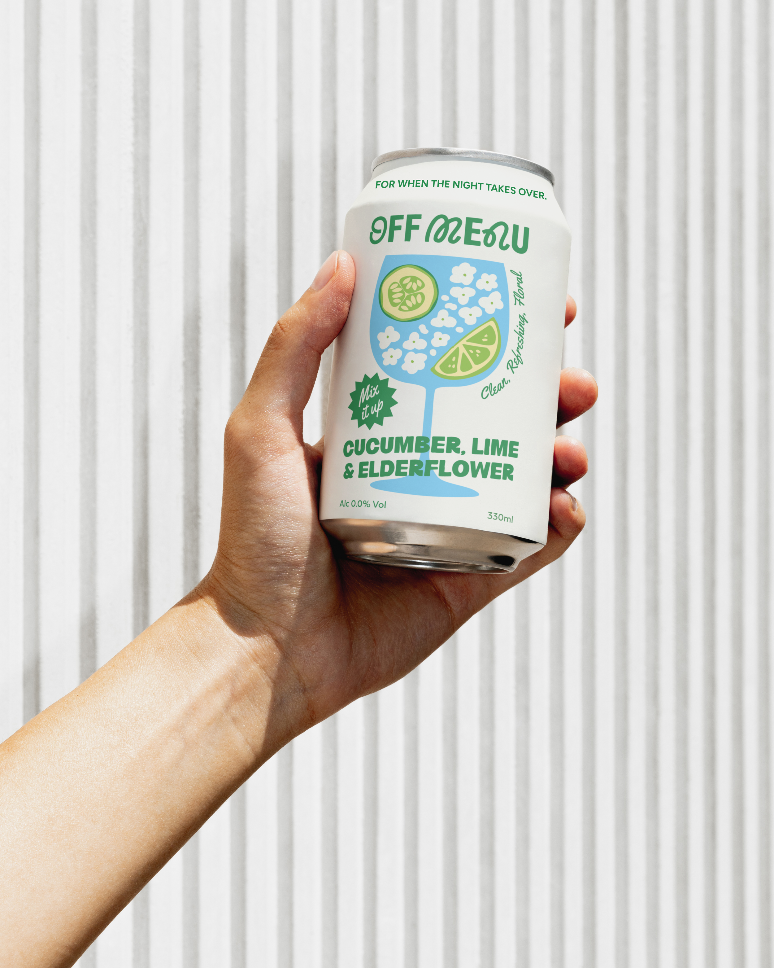
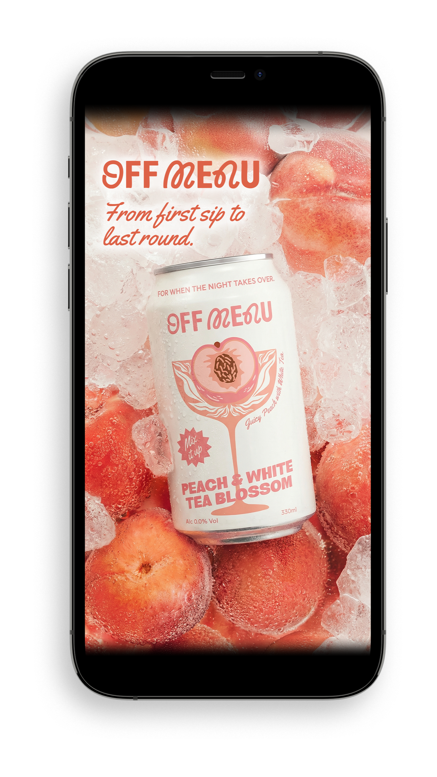
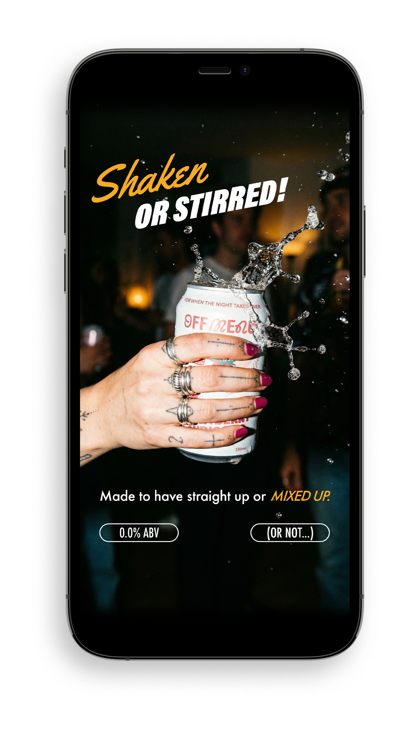
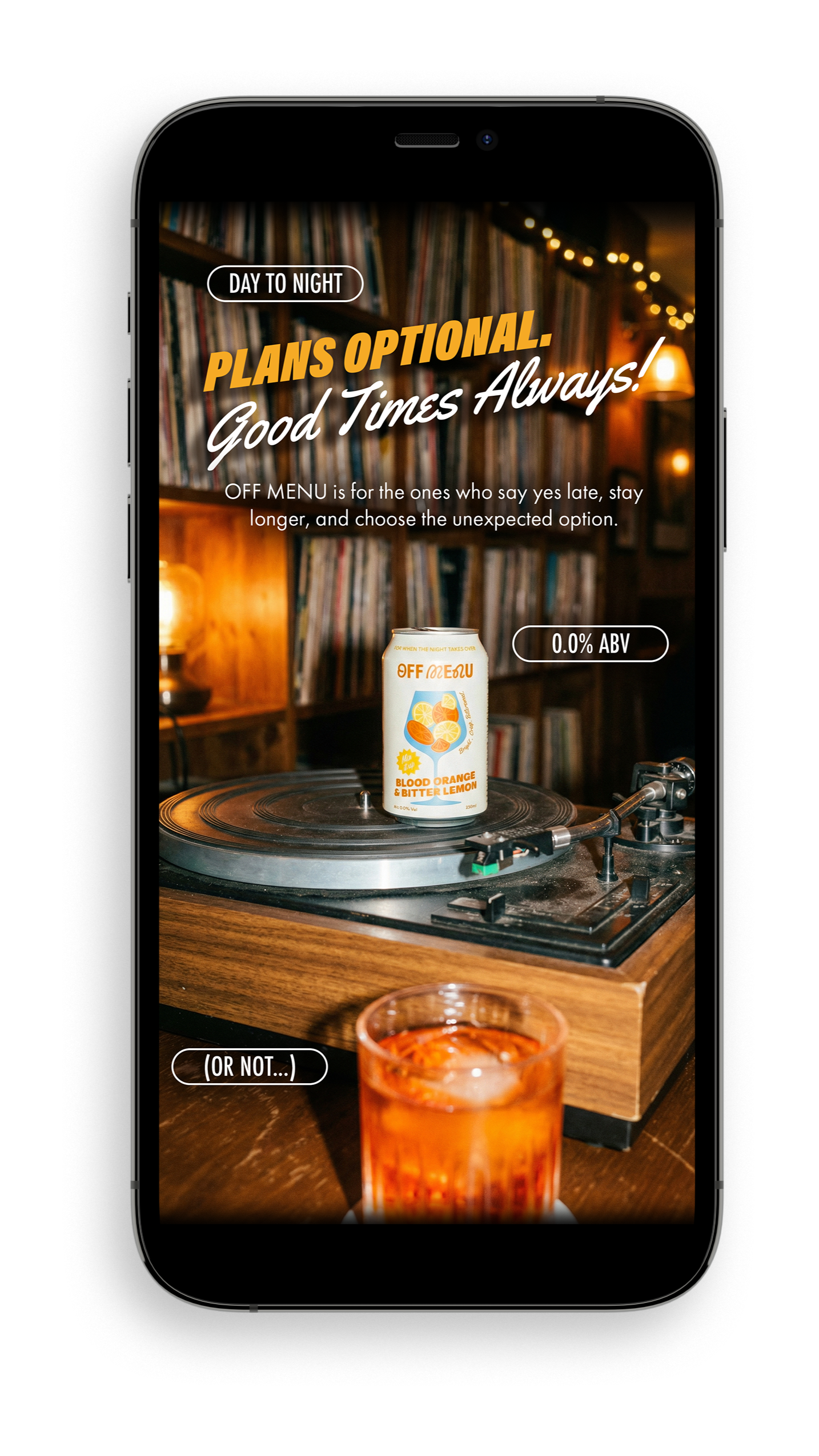
The social ads blend lifestyle-led photography with refined cinematic product shots, creating a tactile connection to the drink.
The visual approach is intentionally dual: warm, moody tones for evening sophistication, and bright, high-contrast imagery for daytime refreshment. This tonal flexibility allows us to speak to different audiences and contexts without fragmenting the brand.
FOR WHEN THE NIGHT TAKES OVER
〰️
FOR WHEN THE NIGHT TAKES OVER 〰️
SOCIAL STRATEGY
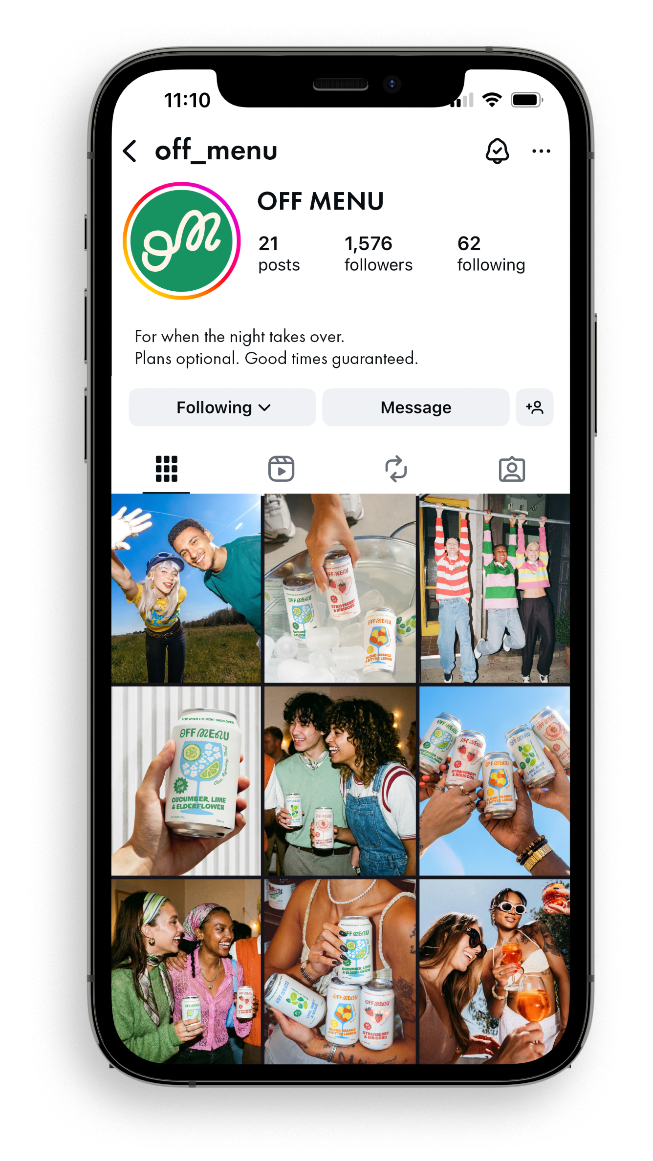
Building a World, Not Just a Feed
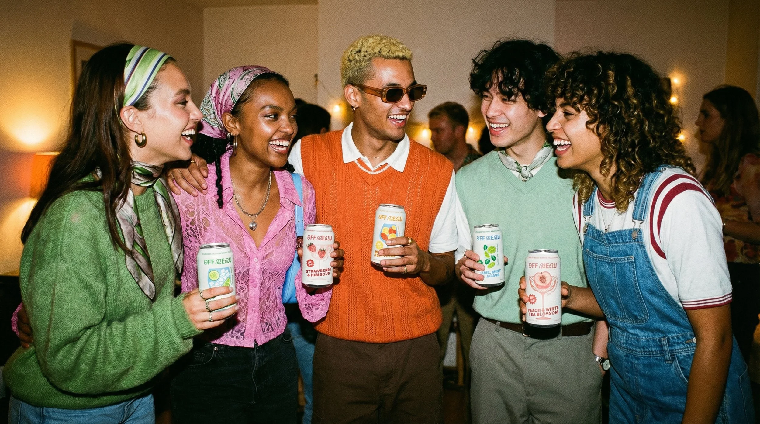
Social media is oversaturated with brands fighting for attention, but selling a product isn’t enough to build genuine connection. OFF MENU will set itself apart by creating a narrative universe that people actually want to follow. Instead of product-first content, we’re building a serialised world around a core friend group, where each character embodies one of our drink flavours.
The storytelling feels intimate and authentic, like you’re part of the group chat, while naturally integrating OFF MENU into the fabric of their lives. It’s not branded content that happens to have characters; it’s character-driven storytelling that happens to feature the brand. This approach transforms followers into invested audiences, creating emotional connection and cultural relevance that traditional product marketing simply can’t achieve.
People don’t just see the drinks, they see themselves in the moments.
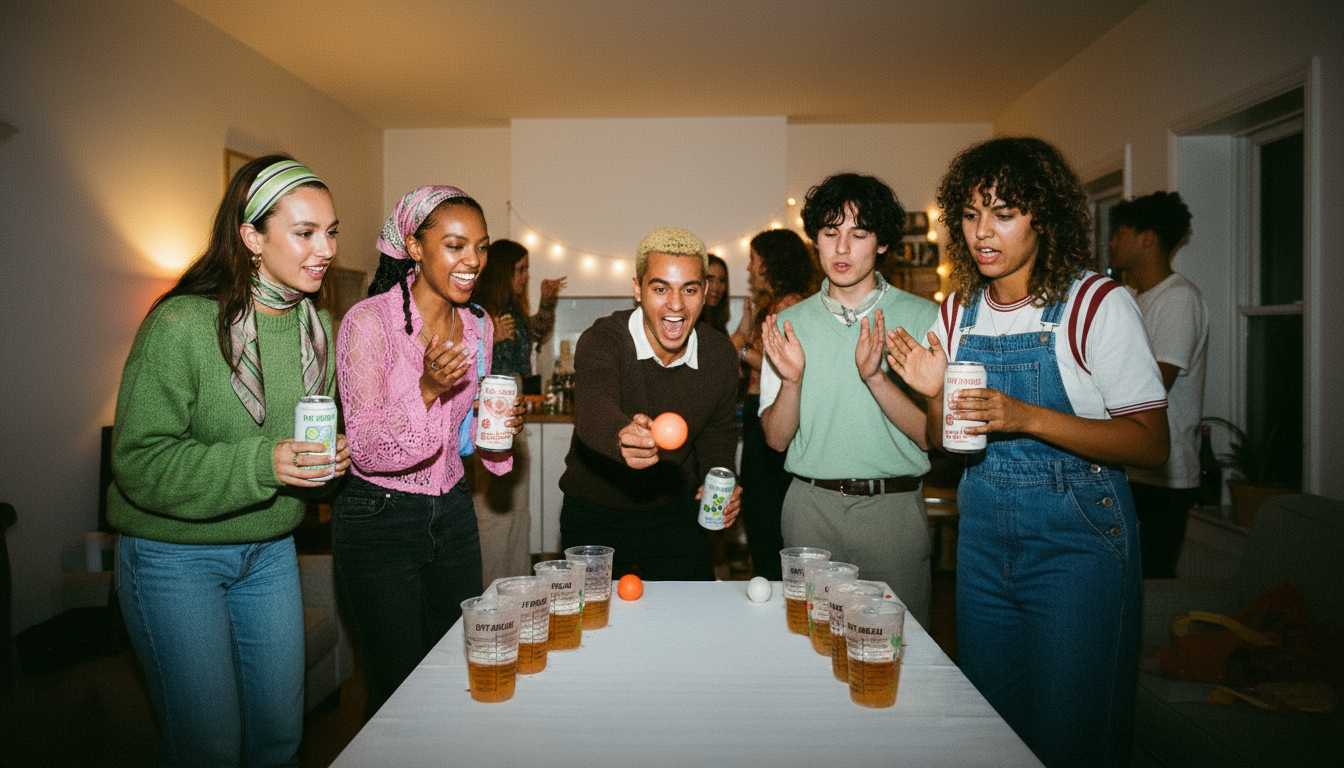
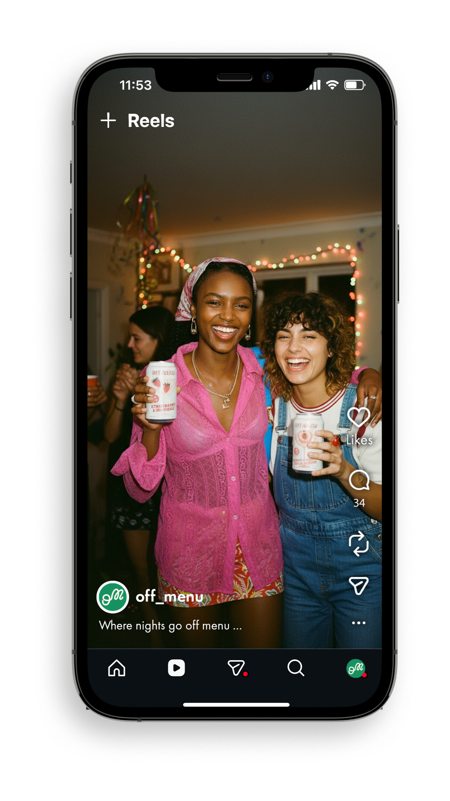
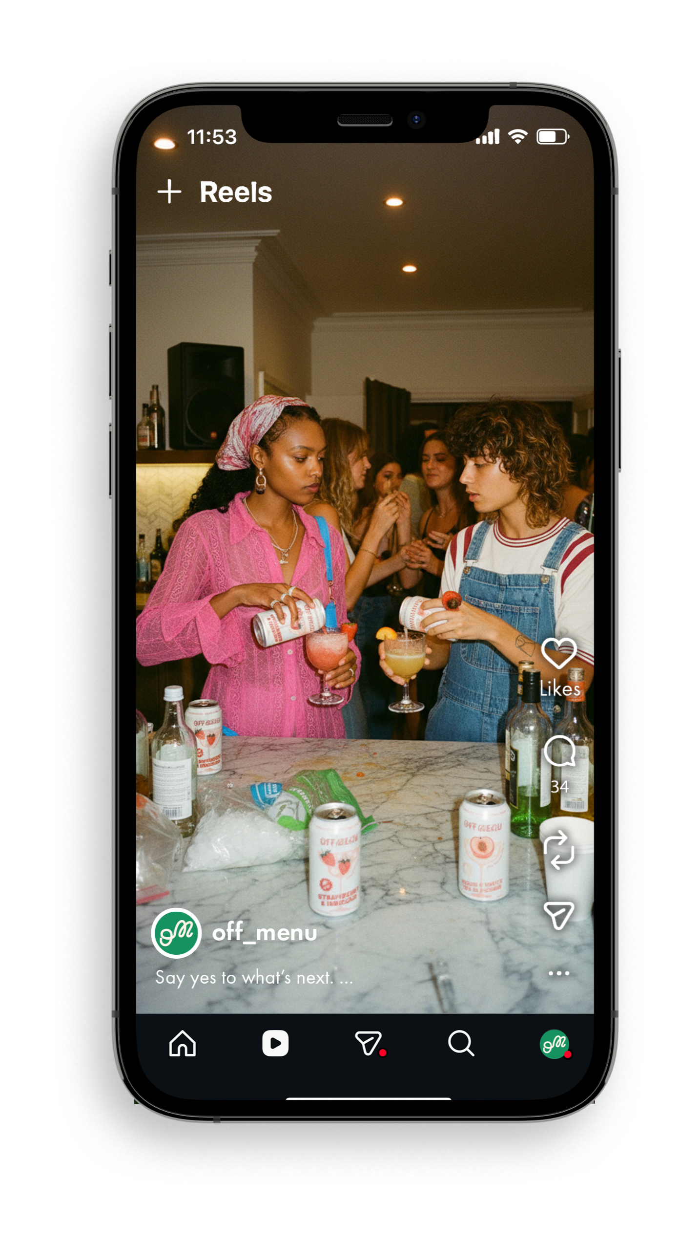
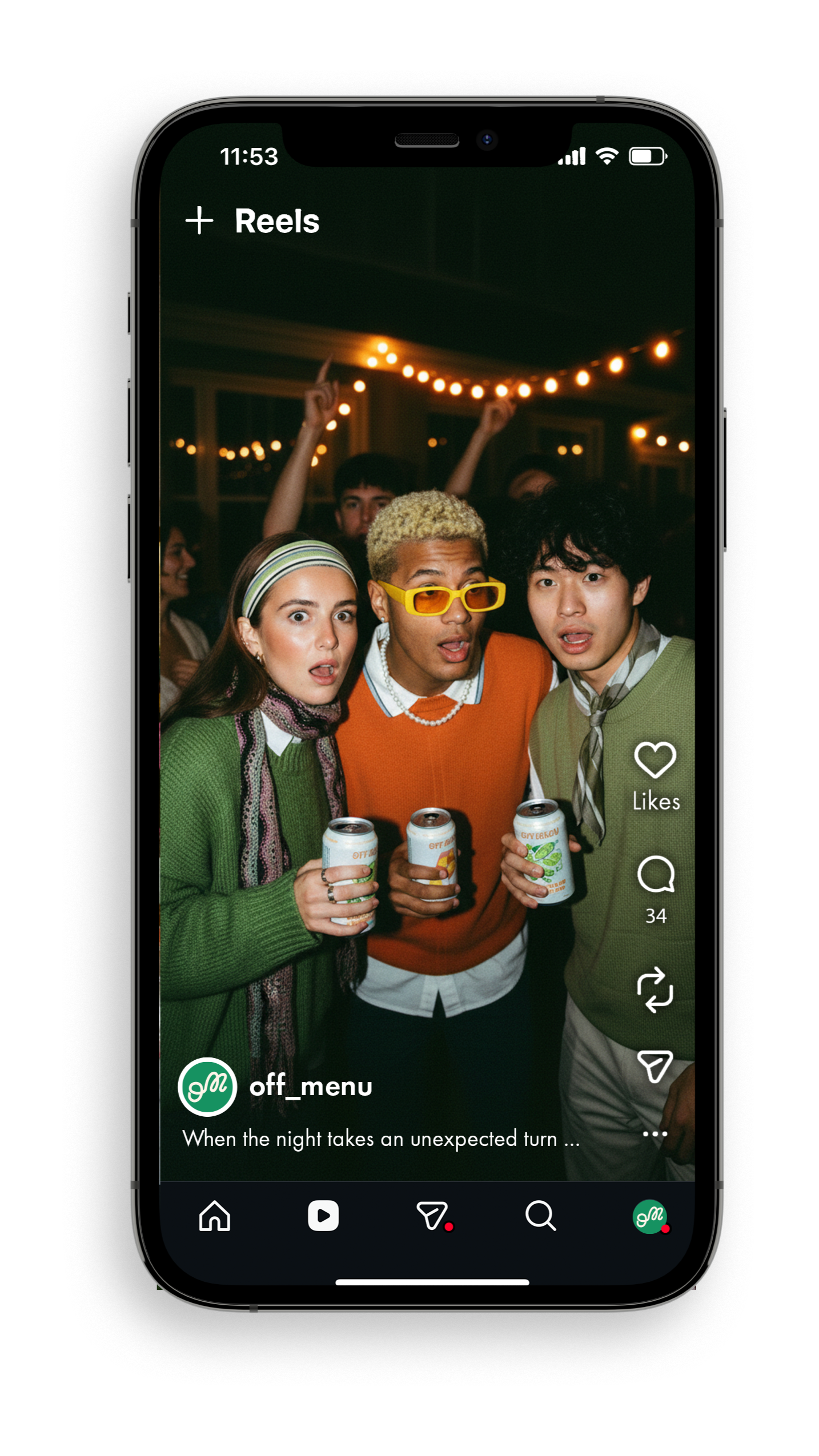
Example story line
PART 1: “The Arrival”
Peach and Strawberry arrive at a house party, OFF MENU drinks in hand, pouring mixers in the kitchen. Mid-laugh, Peach freezes - they’ve spotted their ex across the room talking to Blood Orange. Strawberry notices Peach’s panic. “I need to leave. Right now.” The group immediately rallies around to support.
PART 2: “The Standoff”
The friend group huddles in the kitchen mixing drinks while Lime and Cucumber play beer pong with OFF MENU cups in the background. They’re strategising Peach’s escape route when Blood Orange (from across the room) loudly calls out “PEACH! There you are!” The ex turns, makes direct eye contact. Awkward standoff. The ex approaches: “Hey. Can we talk?”...
PART 3: “The Cliffhanger”
Peach and their ex step aside to talk while the friend group watches anxiously from across the room, speculating. We see Peach and the ex talking in the background, they’re laughing? The ex shows Peach something on their phone. Peach’s expression shifts to shock. Suddenly the front door bursts open. Someone walks in. Both Peach and the ex freeze, staring at the entrance. Blood Orange: “Oh, this just got interesting.”
DAY TO NIGHT
〰️
DAY TO NIGHT 〰️
MERCHANDISE
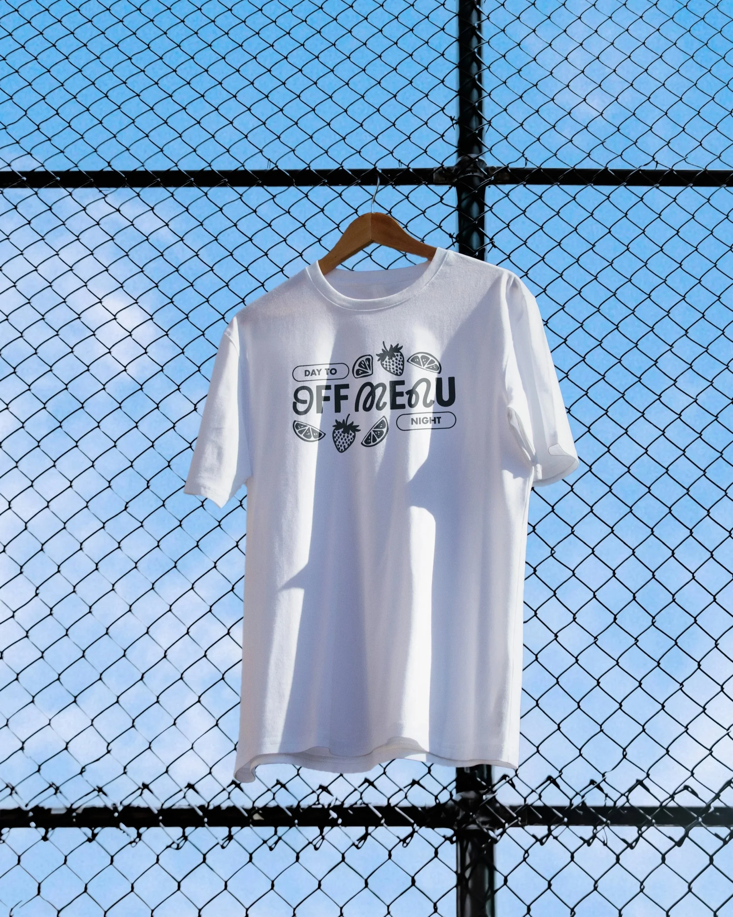
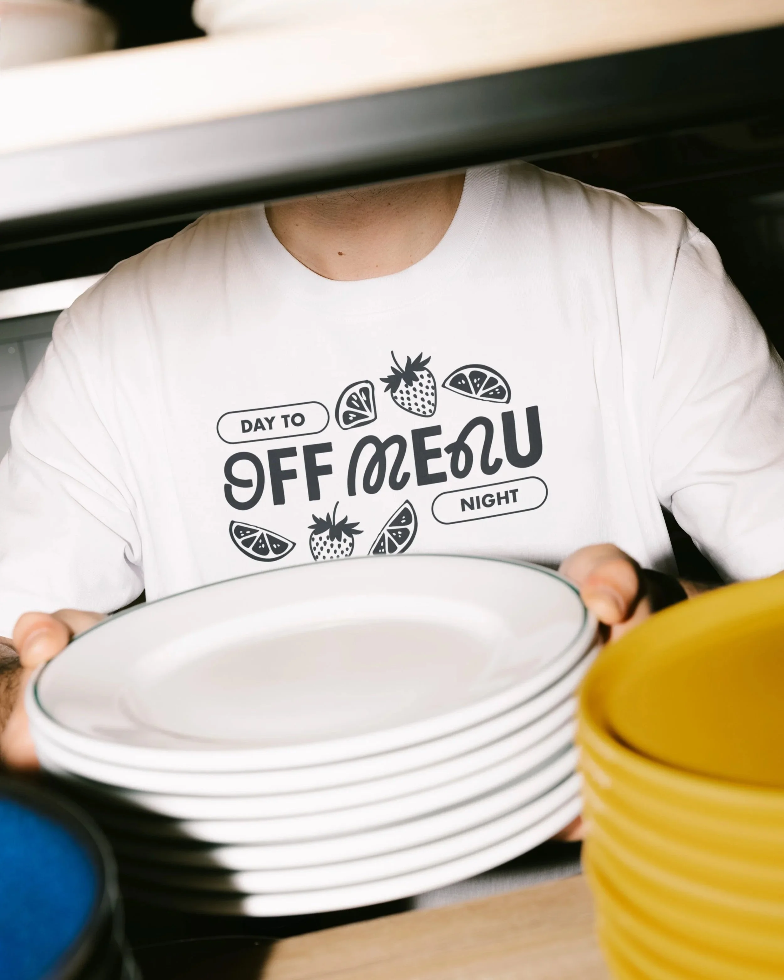
T-Shirts & Totes
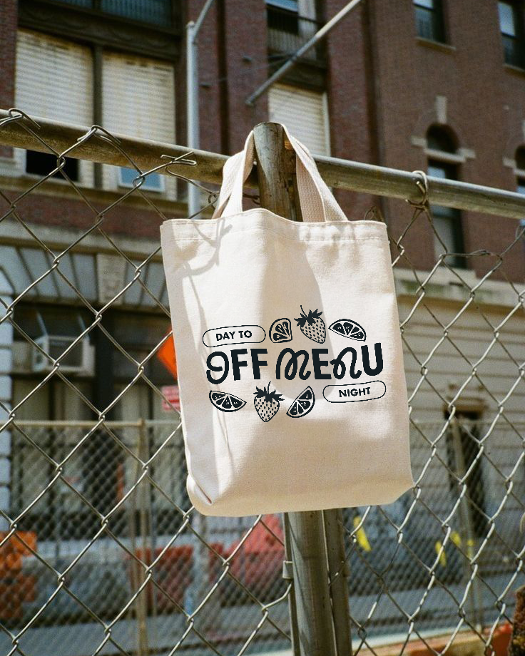
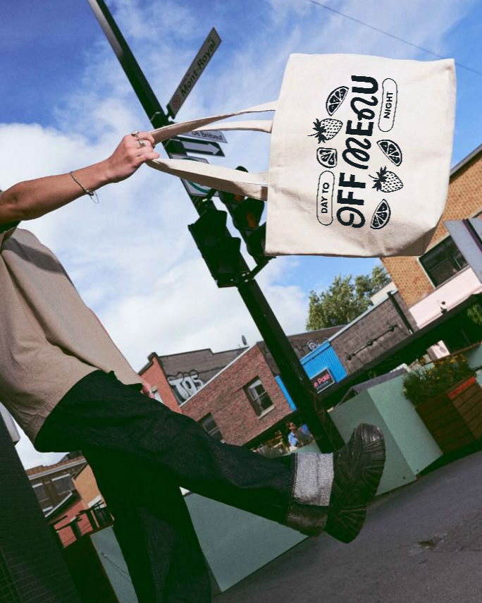
The t-shirt and tote design uses the logo as the focal point, surrounded by illustrated fruit motifs and the tagline “Day to Night”, reinforcing the brand’s core versatility message.
Rather than featuring product shots of the cans, the design leans into the brand’s visual language and illustrated style, making
it a wearable piece of clothing rather than walking advertisement. It’s apparel people would actually choose to wear, not just branded giveaway material.
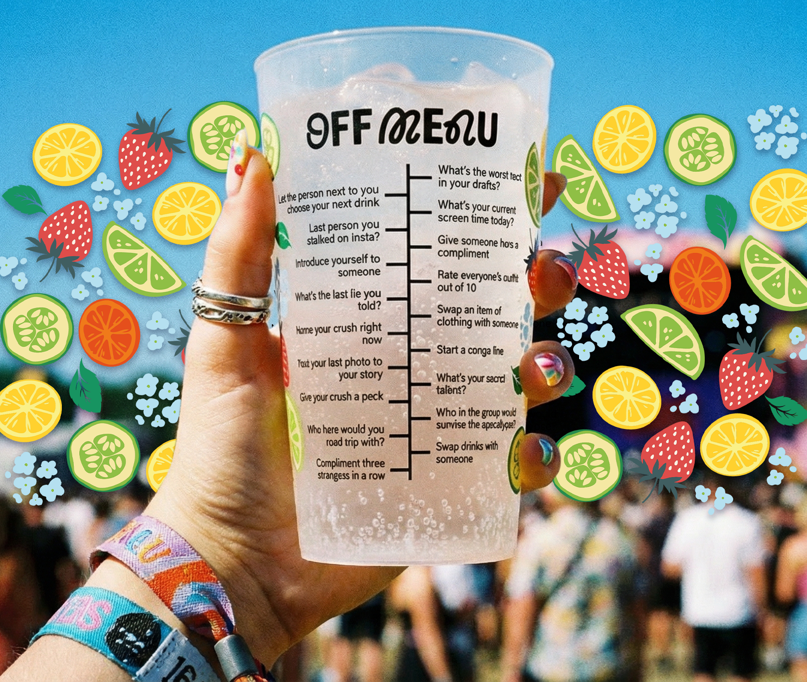
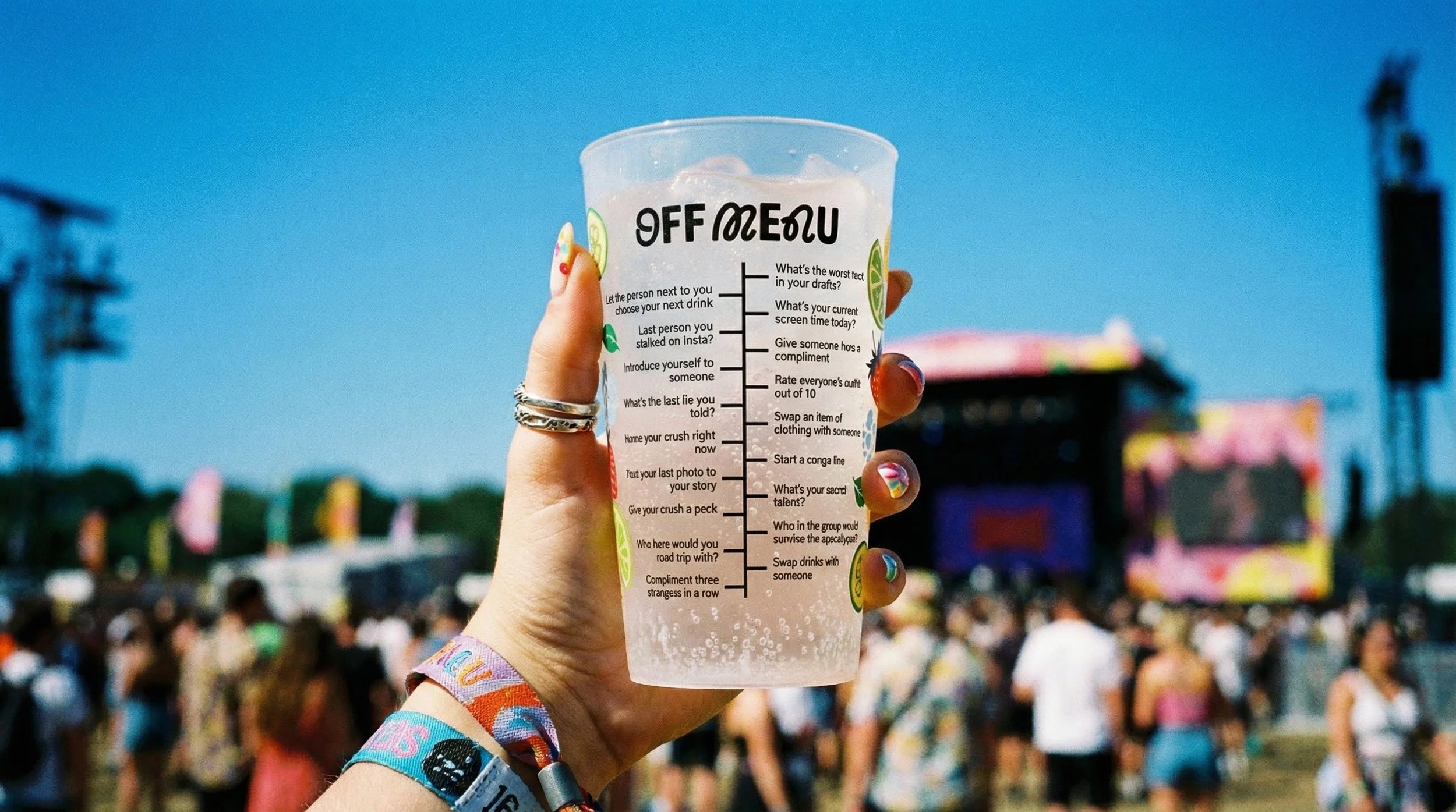
Reusable Cups
Distribute branded reusable cups with a twist: drinking game prompts printed at different levels, such as:
• “TRUTH: What’s your crush’s name?”
• “DARE: Introduce yourself to someone new”
• “MIX: Swap drinks with a friend”
It transforms a sustainability initiative into social currency, every sip becomes a conversation starter.
Cups become souvenirs people actually keep.