Lumina Roma
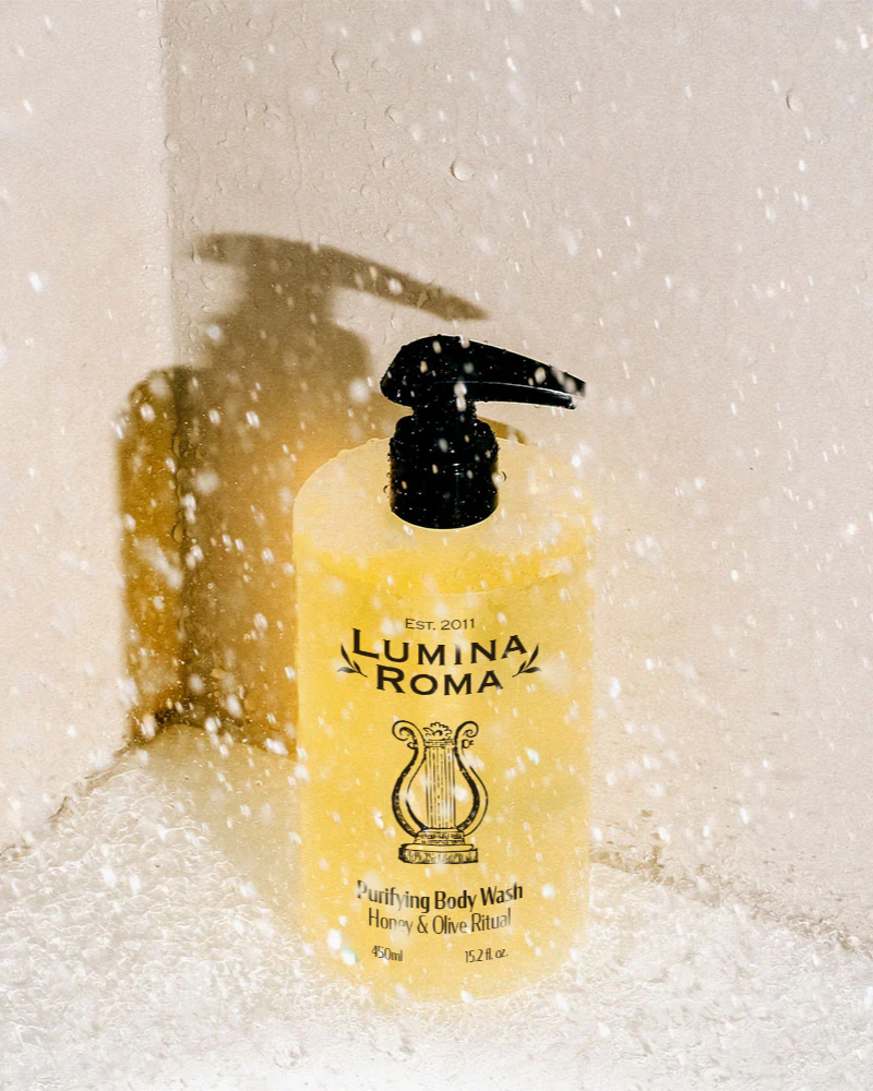
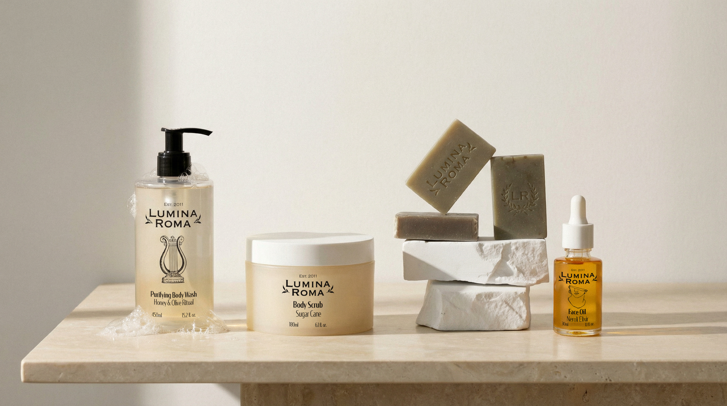
Silea has crafted a refined visual identity for Lumina Roma that bridges millennia, honuoring ancient Roman bathing traditions through a distinctly contemporary lens. The packaging design celebrates the grandeur of imperial Rome while embracing modern minimalism, creating a collection that feels both timeless and thoroughly of-the-moment.
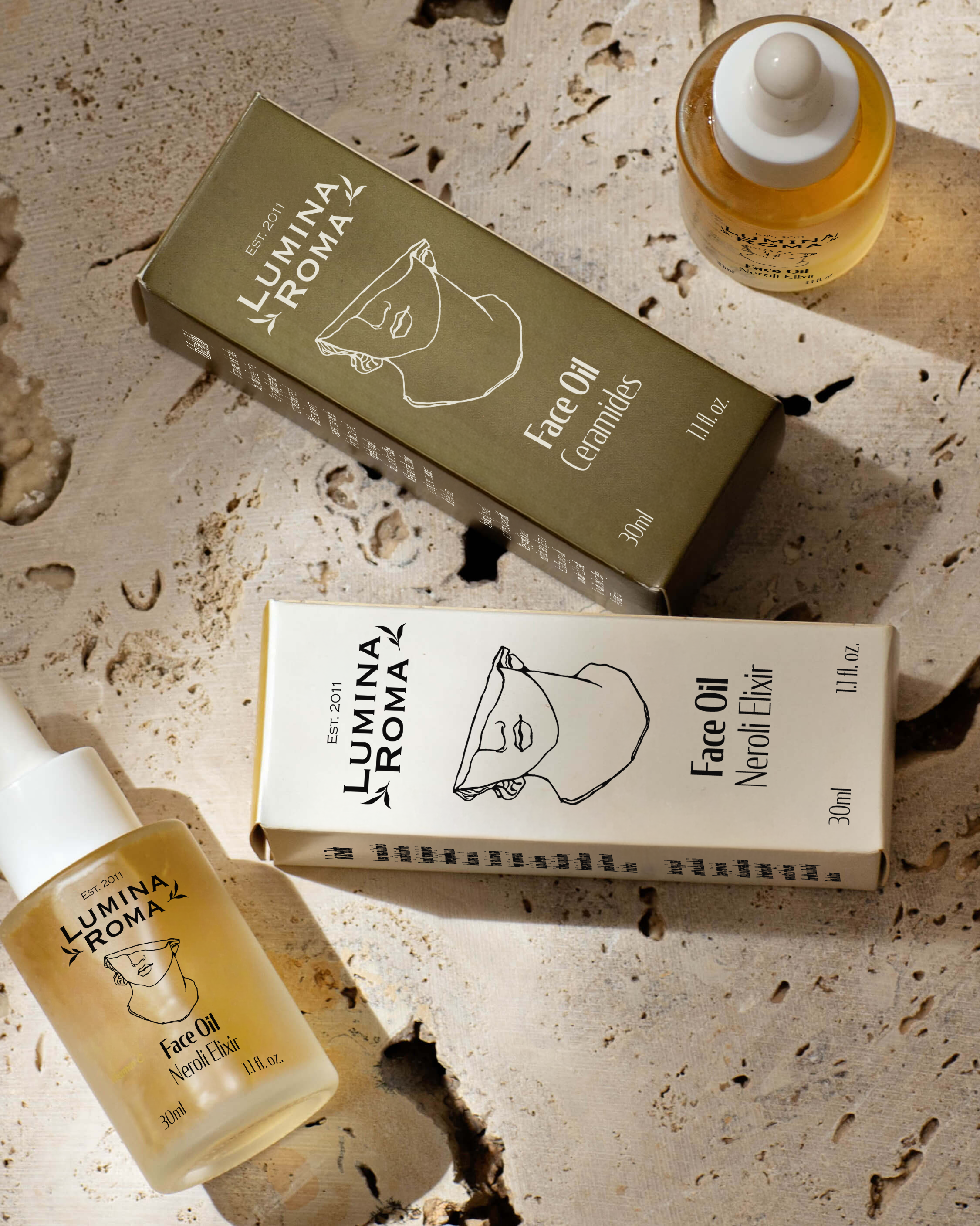
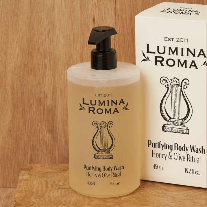

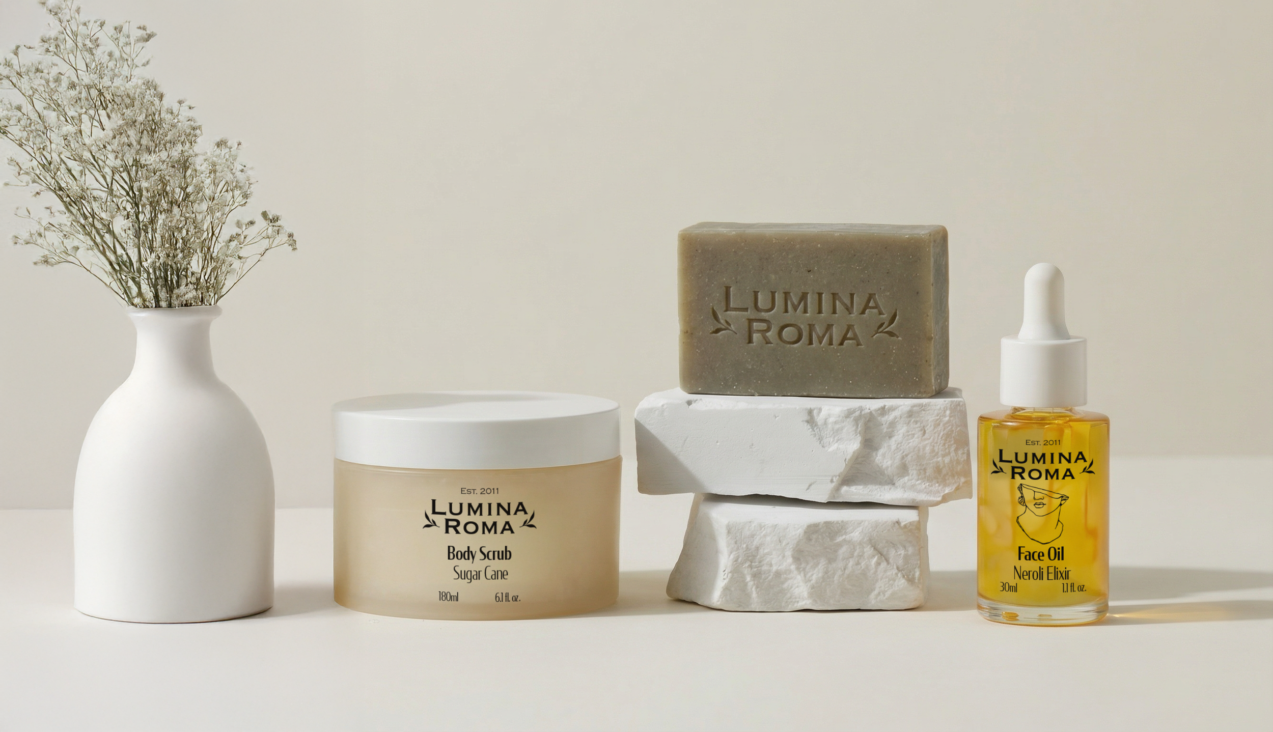
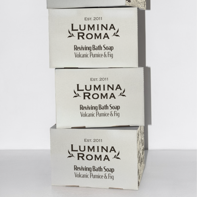

The branding weaves together carefully curated Roman illustrations with geometric mosaic tile patterns, nodding to the intricate floors that adorned ancient bathhouses. These classical elements are balanced with clean, minimal typography that allows the historical references to breathe rather than overwhelm.
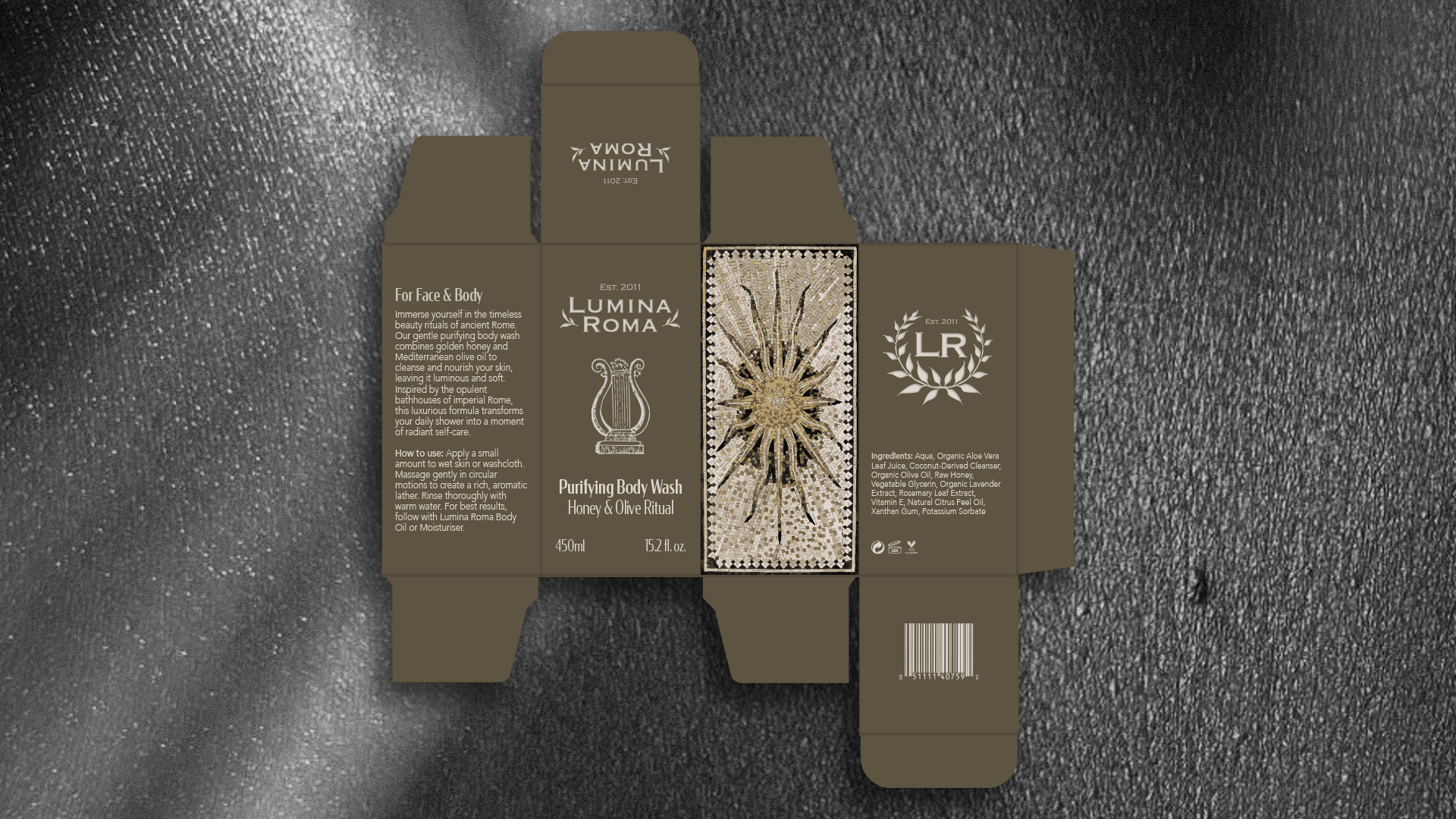
Each product becomes a small artefact, where delicate line work depicting Roman figures and architectural details sits harmoniously alongside the sharp simplicity of sans-serif type. The mosaic motifs add texture and visual interest without cluttering the composition, their repetitive patterns echoing the ritualistic nature of skincare itself.
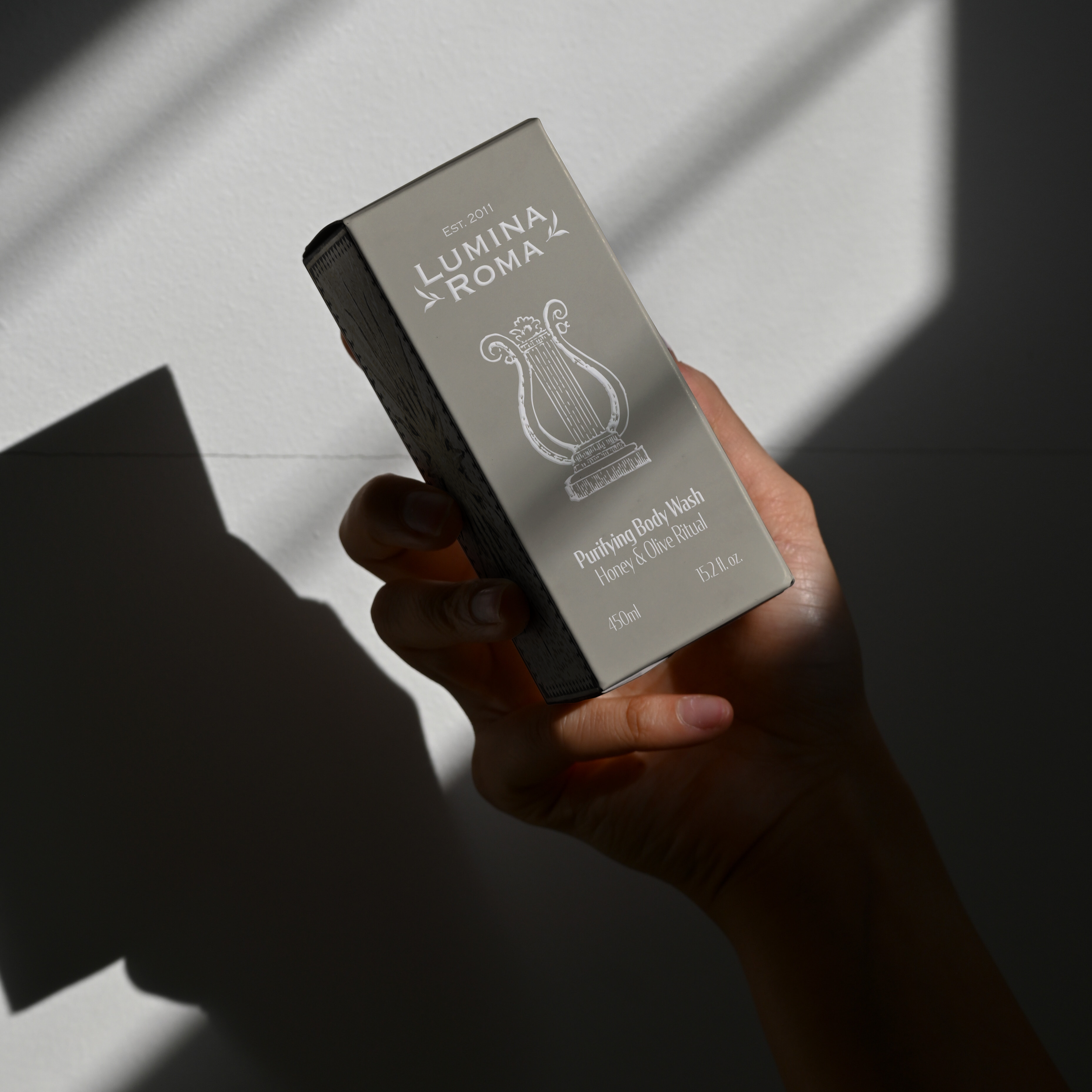
Silea's restrained approach ensures the ancient inspiration enhances rather than defines the brand,this is not costume drama, but rather a thoughtful conversation between past and present. The minimal aesthetic allows the natural, organic ingredients and the quality of the formulations to take centre stage, while the Roman references add narrative depth and cultural richness.